Role
UX Research
UI Design
Duration
4 weeks
Responsibilities
Conducting user interviews
Paper and Digital wireframing
Data gathering and analysis
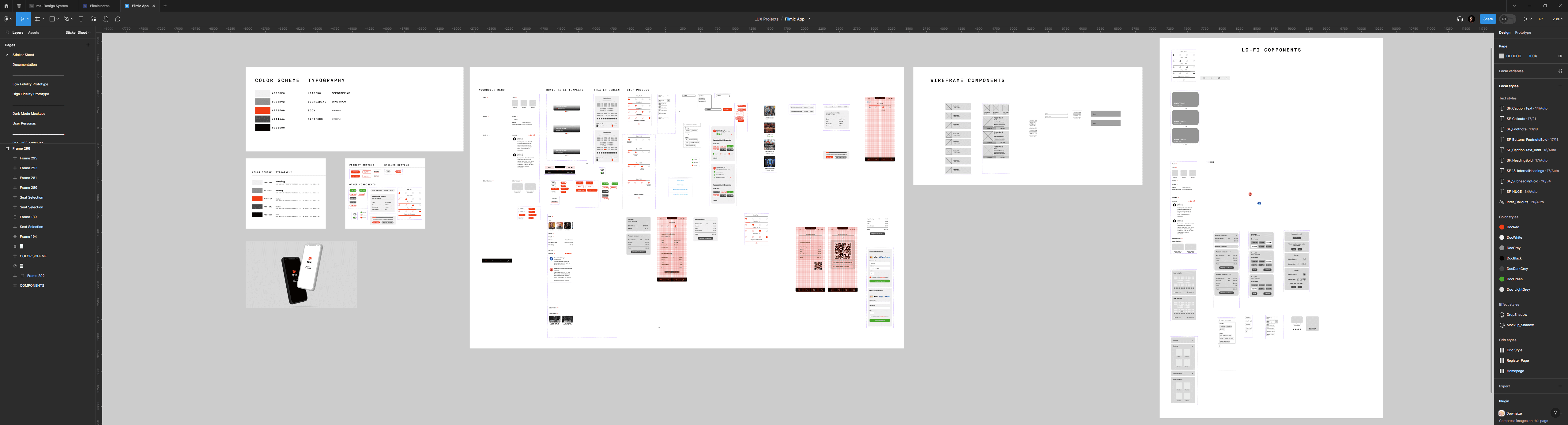
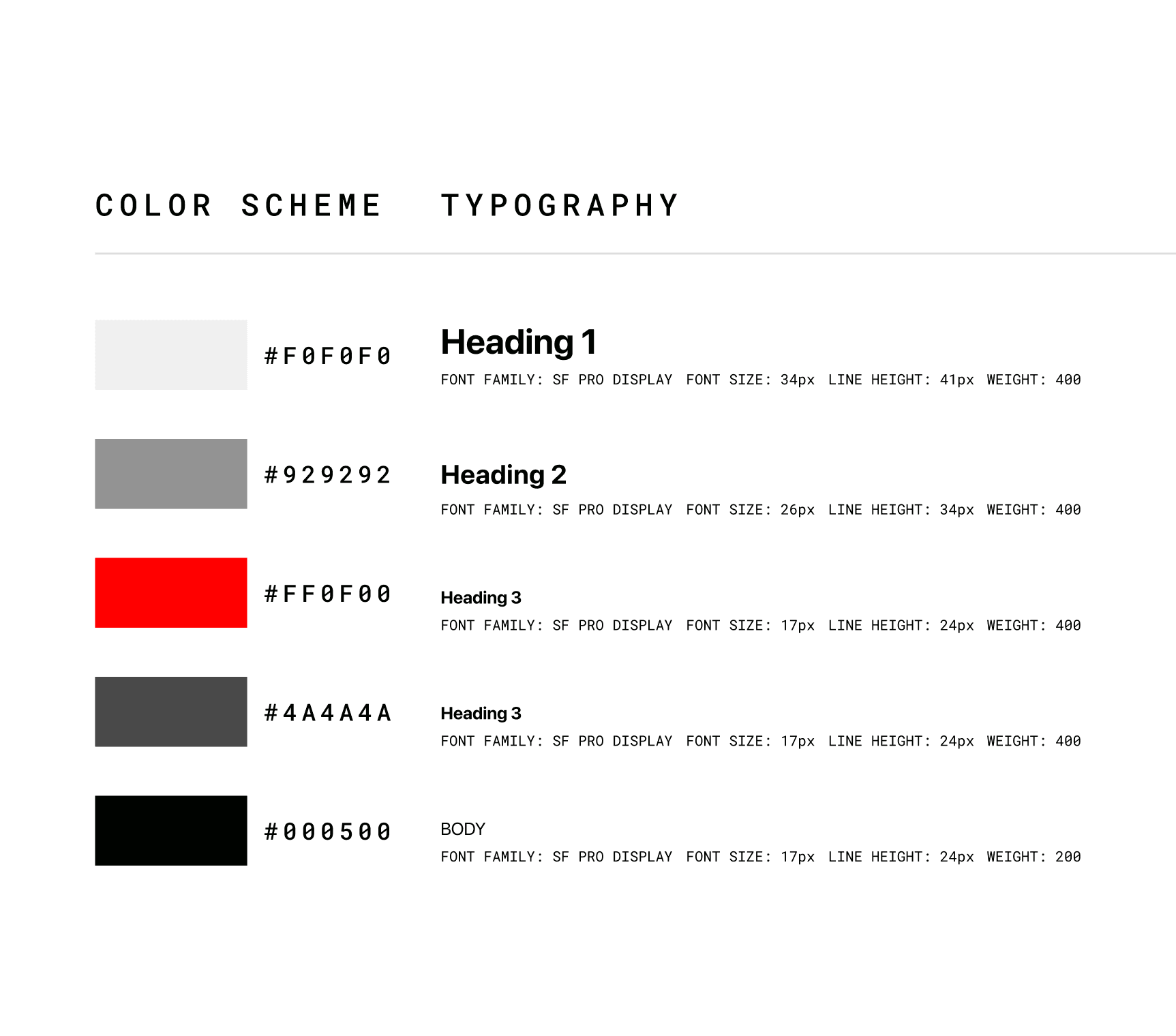
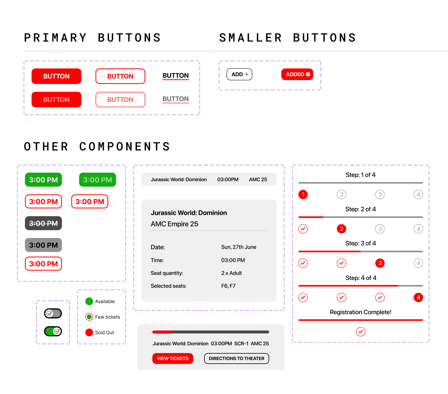
Creating the design system
Tools
Figma
Adobe creative suite
Project Overview
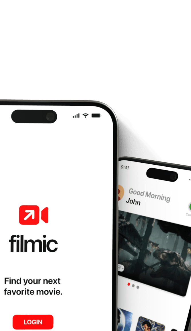
In today’s world, the amount of distractions that we have are endless. Imagine trying to look for a movie to watch, you click on a trailer and before you know it, you’re 45 minutes into watching cute cat videos. This is a pretty problematic. Enter Filmic.
Filmic is an iOS app that was created for viewing movie trailers and booking tickets, all in one place. It takes you from trailer to theater in record time.
Scope
Problem
Users frequently struggle with navigating multiple applications to complete the process of viewing trailers and purchasing tickets.
User goals
Ability to watch movie trailers and book tickets without getting distracted. Ability to find age-appropriate movies for children based on standardized metrics and user reviews.
Product goals
Ability to provide personalized recommendations based on user indicated interests. Unification of the experience of viewing trailers and ticketing in one space, so users don't have to switch between apps.
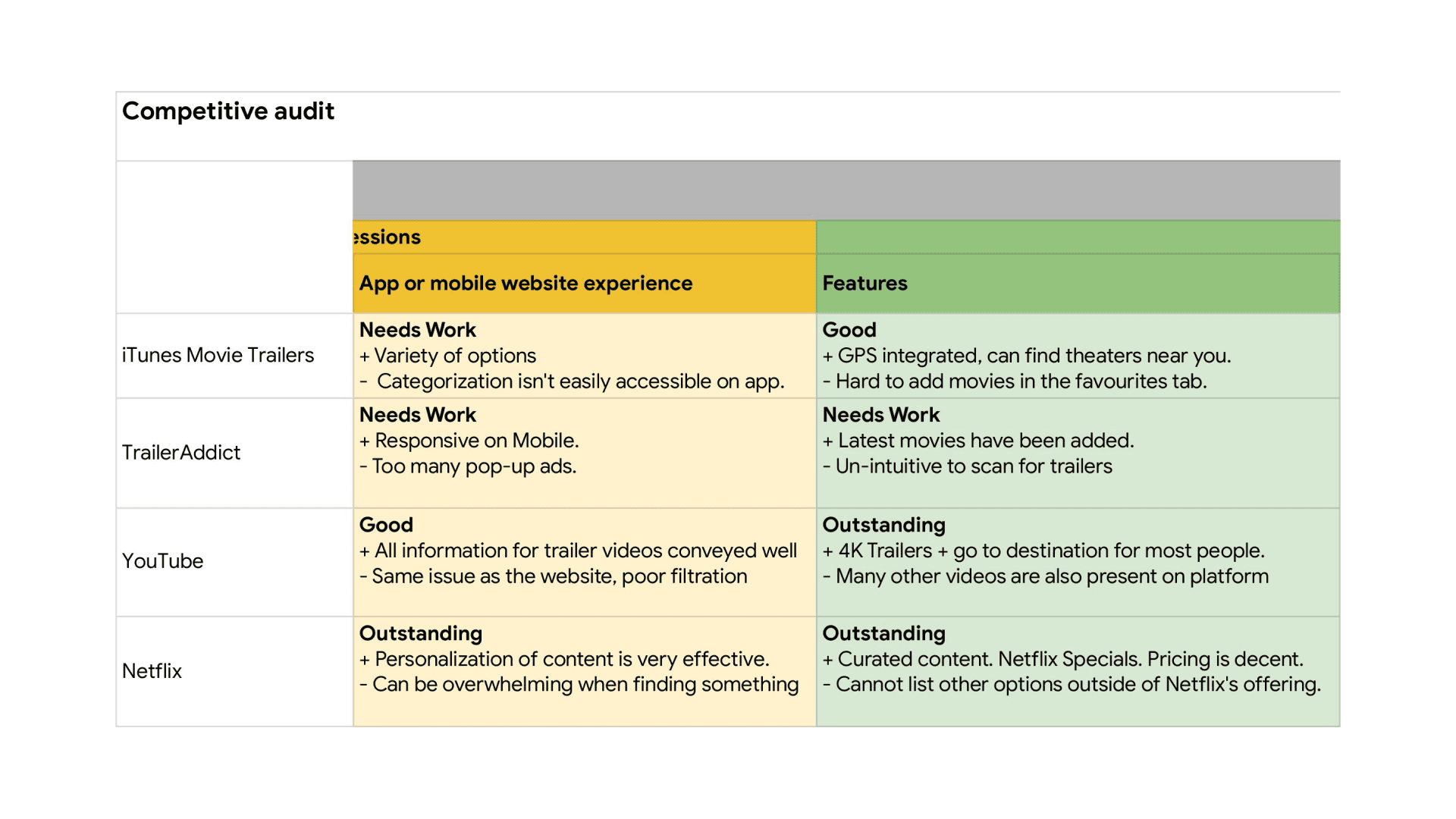
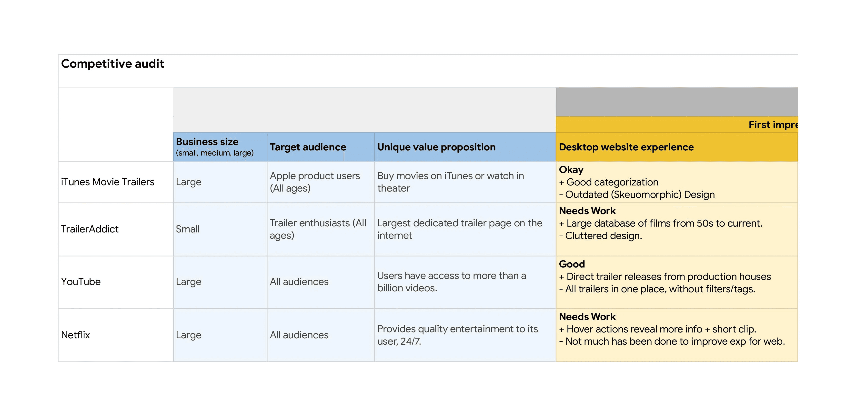
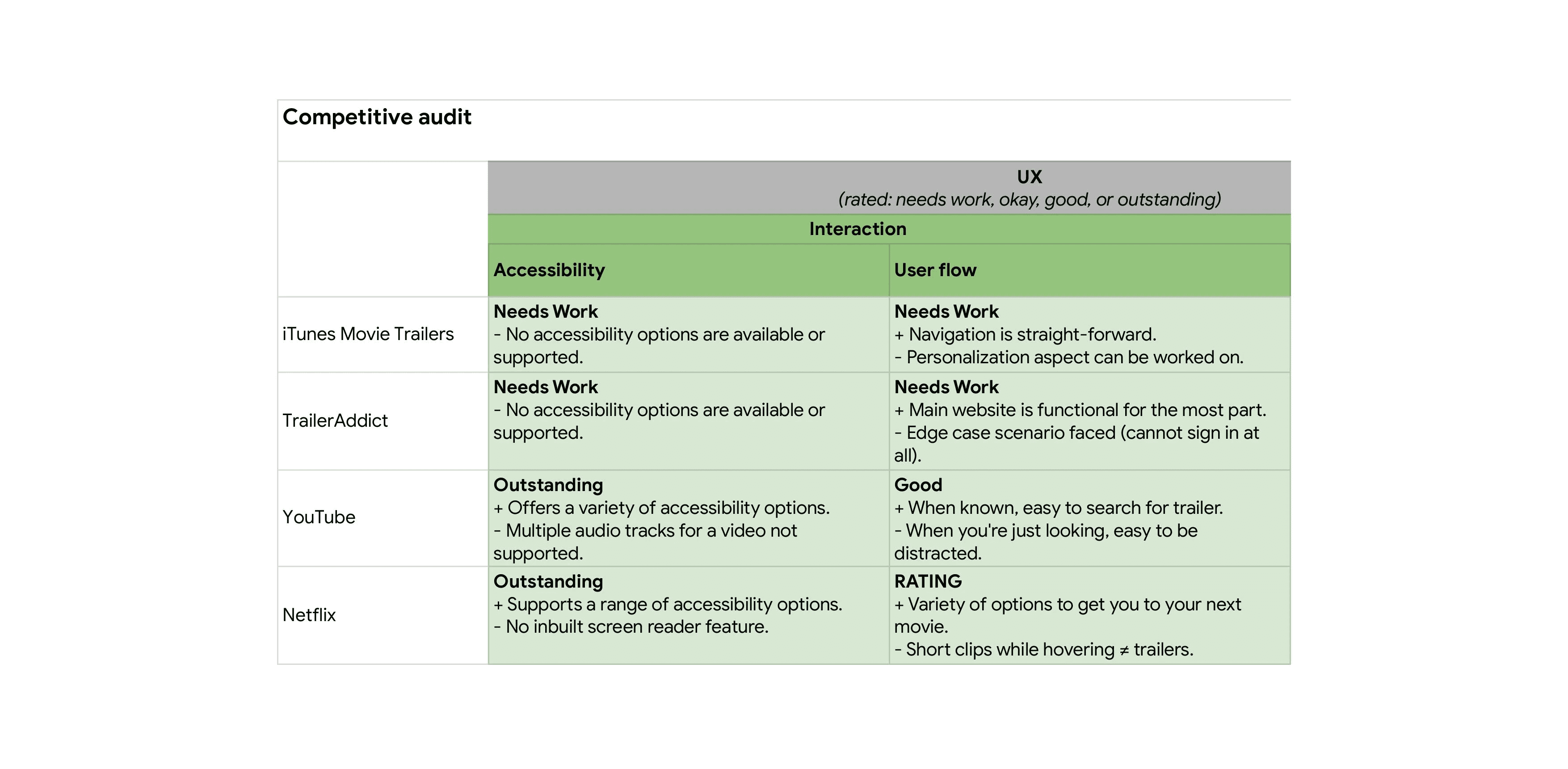
The main research for this project was done through user interviews and competitive audits. Doing these were crucial to understanding what the pain points the users had with existing applications and how they could be improved.
User research
While doing the user research, I conducted a few interviews of participants to empathize and understand their perspective on how they go about viewing trailers and booking their tickets.
Some of the research questions I looked into were as follows:
Does a personalized feed help in finding a desired movie?
Is booking through the same app a feature the users want?
What are the other features that could be missing from this app?
Would looking at user reviews for movies help people in making the right decision?
Does the app require a social media component to be successful or not?
These were the main pain points that were discovered:
Pain points
User insight
"The amount of looking around to figure out what I want to watch can be overwhelming at times. Even when I'm on Netflix, there are times when I'm trying to find something for 10 minutes and I just can't seem to find anything that interests me."
- UR Participant #2
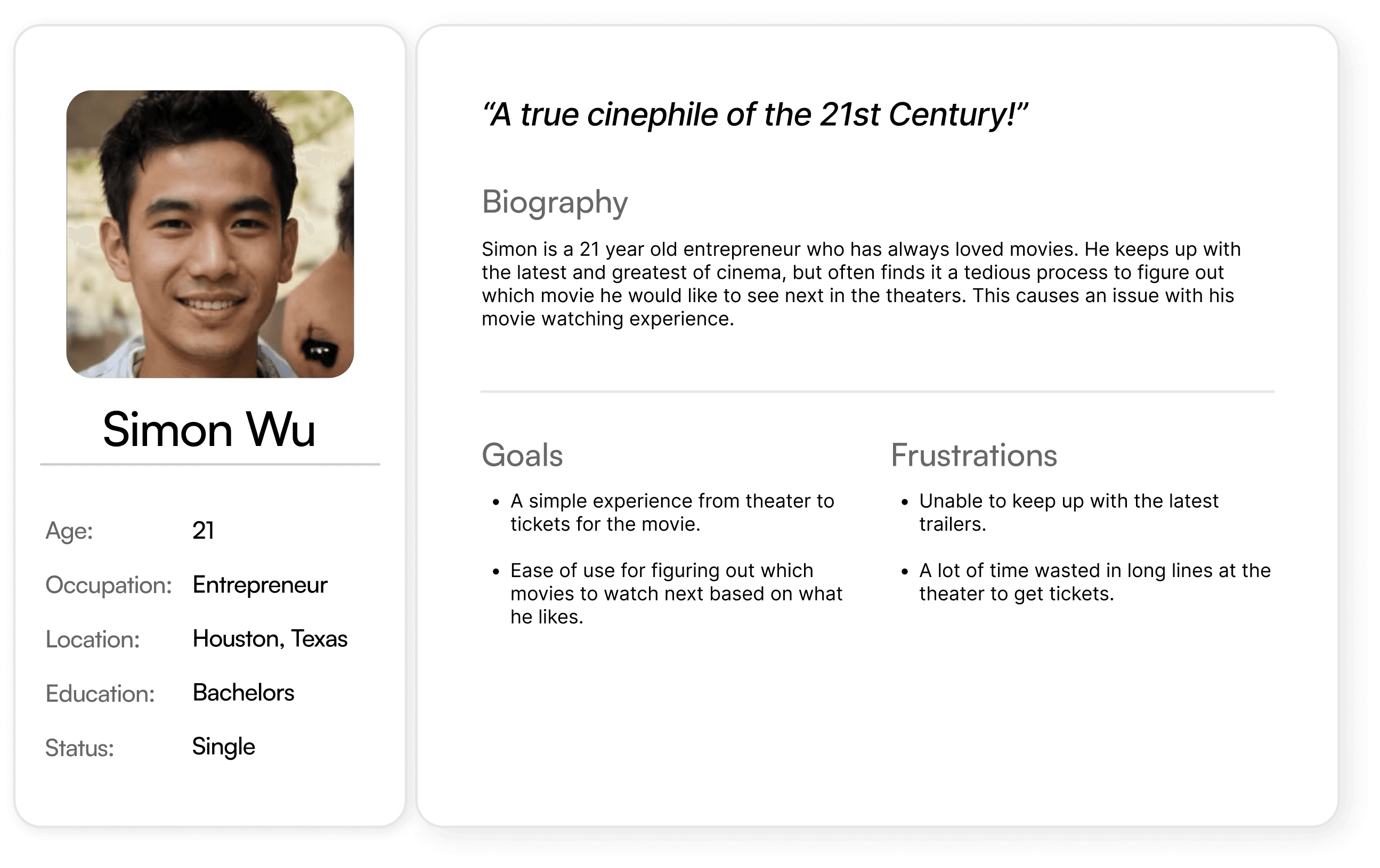
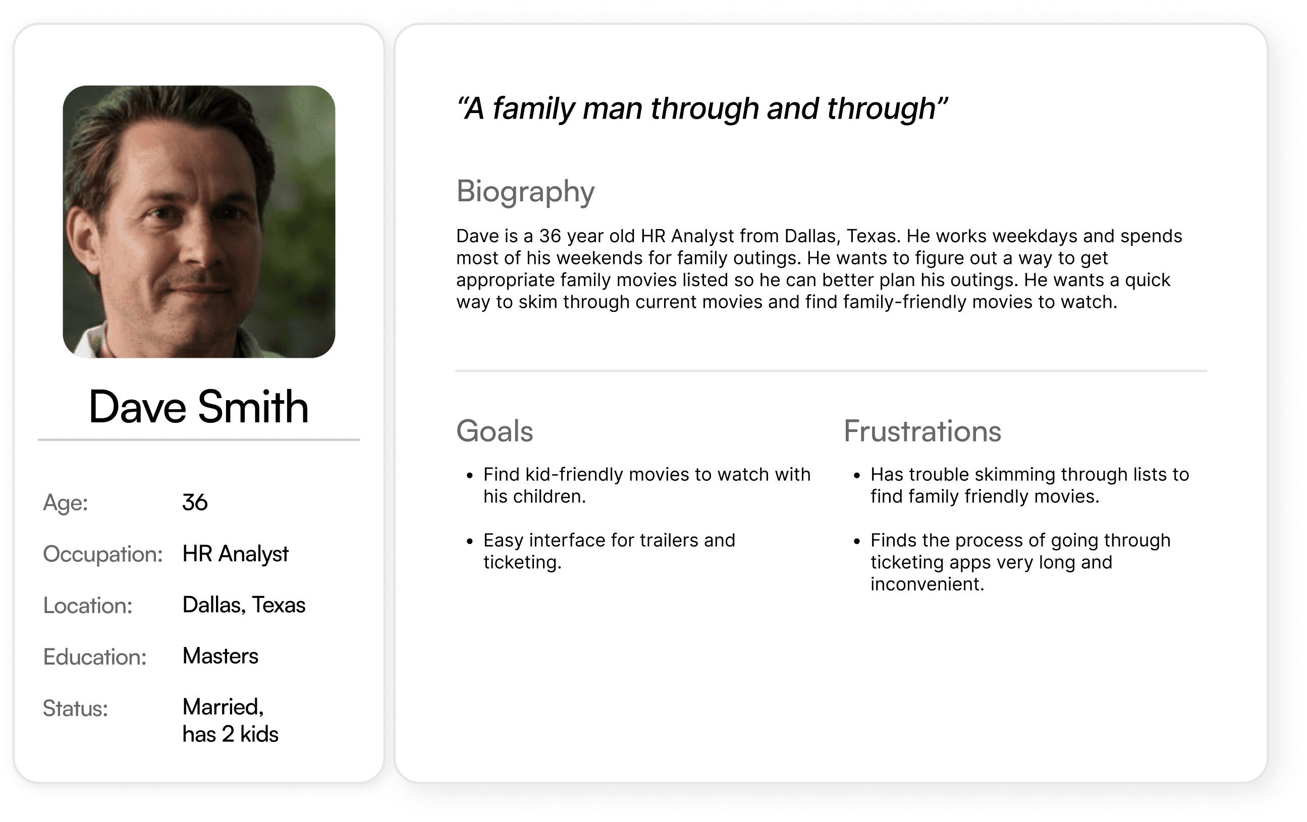
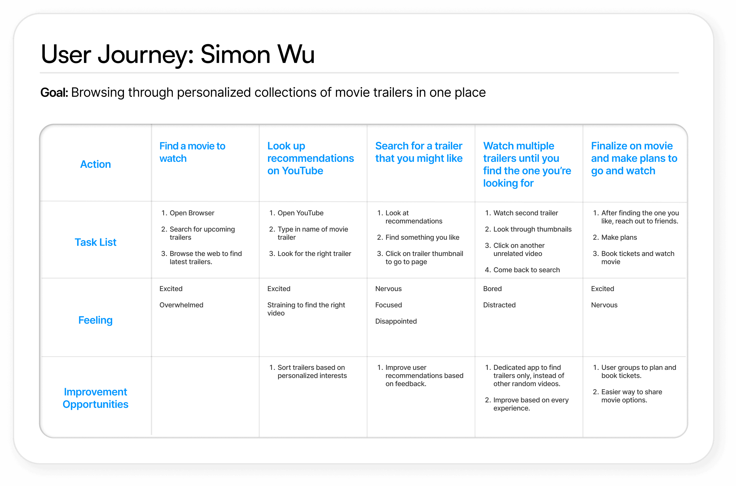
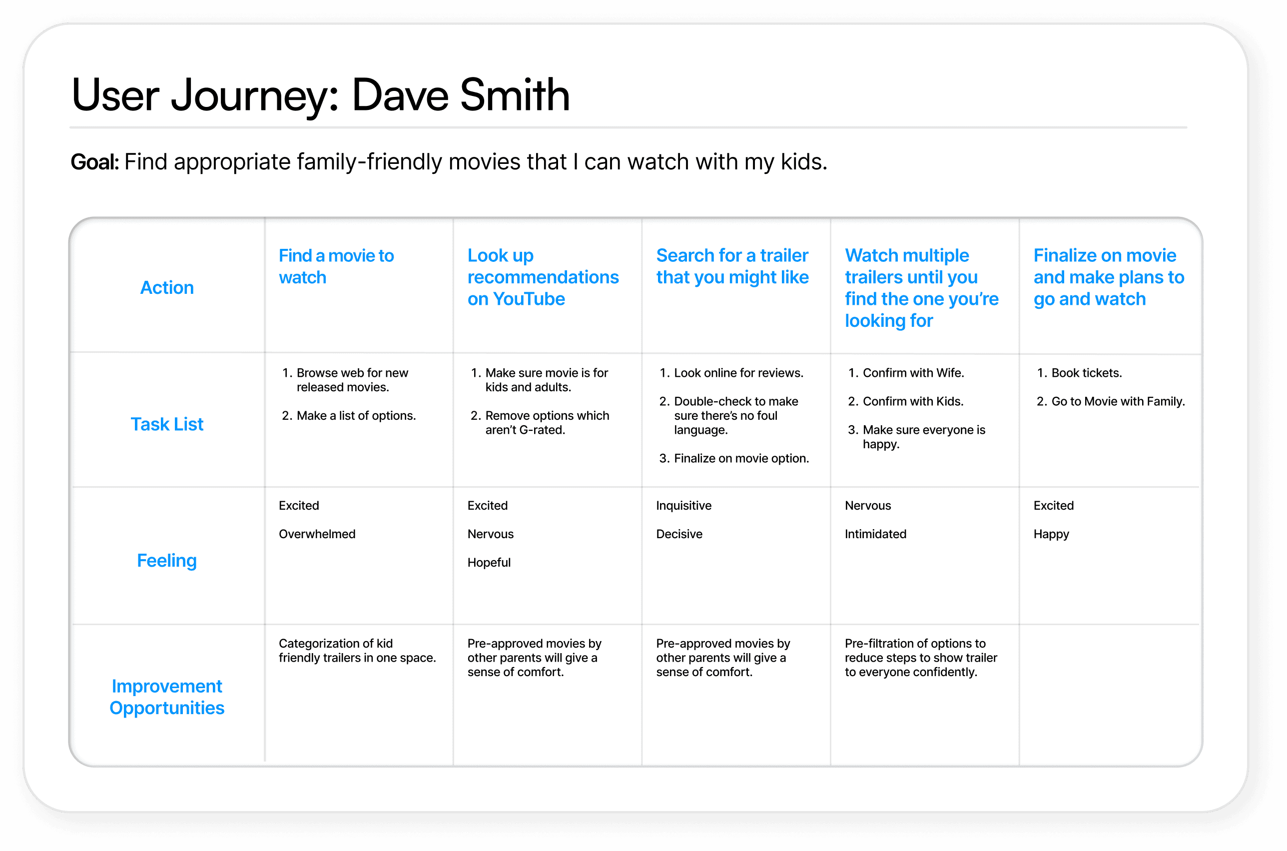
User personas & journey maps
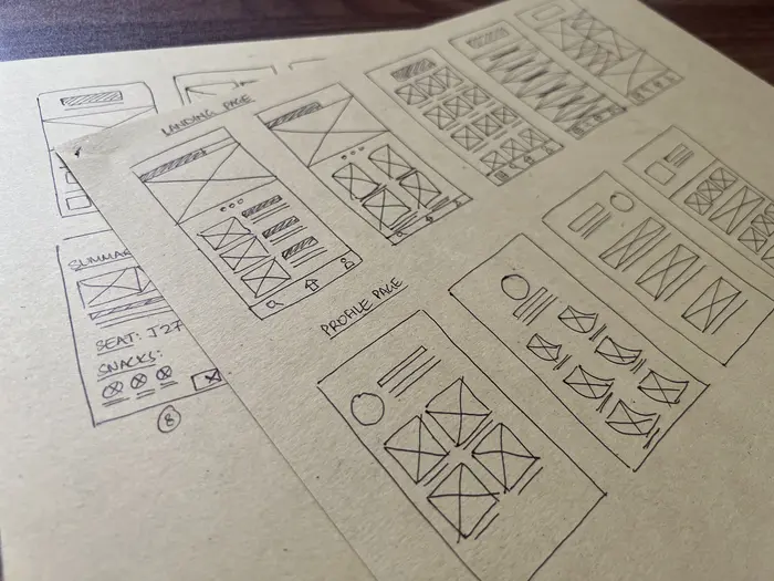
With a basic idea of what the app would look like, I started working on creating paper wireframes to build the first few iteration of the design.
Paper wireframing
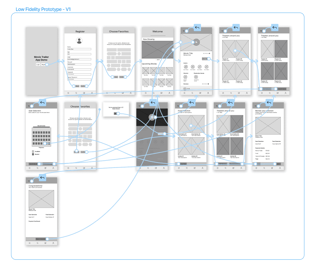
Following visual guidelines, I was able to come up with various possible options for the layout. After figuring out which ones worked best, I started making digital wireframes and low fidelity protoypes for usability testing.
Low fidelity prototype - V1
KPI's for evaluation:
drop-off rates;
conversion rates;
& system usability scale.
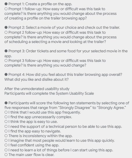
Usability testing
Methodology:
Type:
Moderated remote usability study
Participants:
Five participants, between the ages of 24-54
Script:
Tasks followed by survey questions, measured by Likert scale (Strongly disagree - Strongly agree)
KPI's for evaluation:
drop-off rates;
conversion rates;
& system usability scale.
Key insights #1
Some of the quantitative feedback that we gathered from the user testing was as follows:
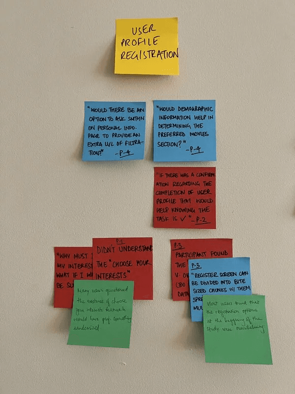
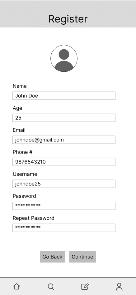
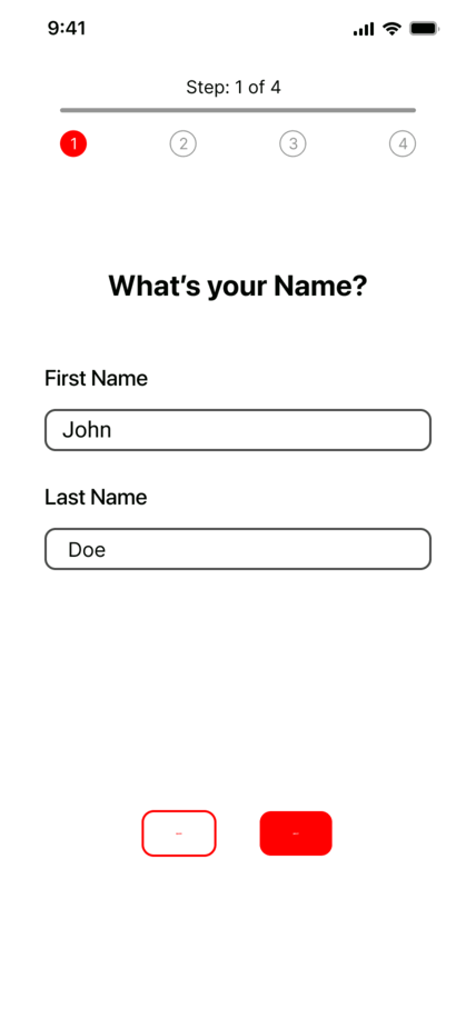
Registration was overwhelming
Users prefer smaller and easier steps for registration instead of all options being presented at once.
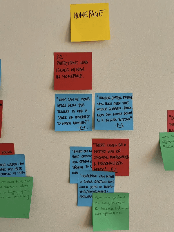
More options to choose from
Users would want more options on the homepage to choose their desired movies from.
Enable external notifications
Users wanted an option to send an external notification and/or a more visual confirmation after tickets have been booked.
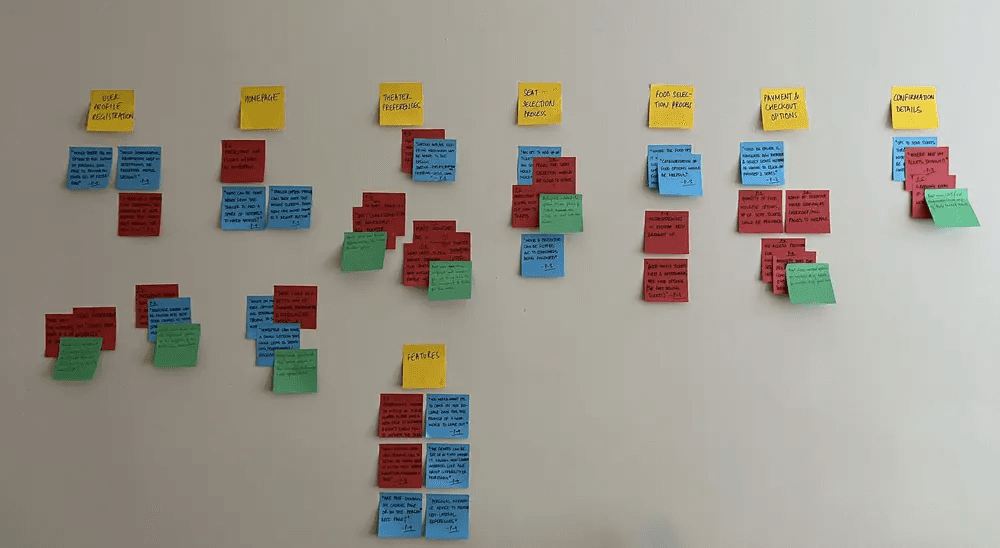
Affinity diagramming
The usability study helped quite a bit, as I got super valuable feedback. To combine all the ideas in one place, I created an affinity diagram to come up with actionable insights.
This exercise created structure around the project and all the ideas were starting to shape up!
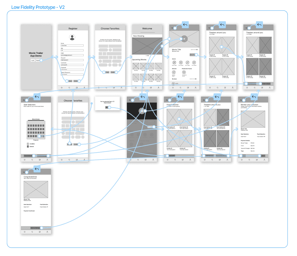
Low fidelity prototype - V2
Based on the collective user feedback from the first usability study, I was able to re-iterate the lo-fi prototype to add features that were lacking in the previous version.
This prototype was also worked on quite a bit more, and the 'look' of the app started falling in place.
After making V2, I conducted a second moderated usability study to get more feedback.
KPI's for evaluation:
drop-off rates;
conversion rates;
& system usability scale.
Key insights #2
Some of the quantitative feedback that we gathered from the user testing was as follows:
Lack of clarity regarding confirmation
Users had trouble understanding if their tickets were booked after going to the main homepage.
Booking detail visibility
85% of the user participants wanted the option to see the details of their booking at all times in the booking process.
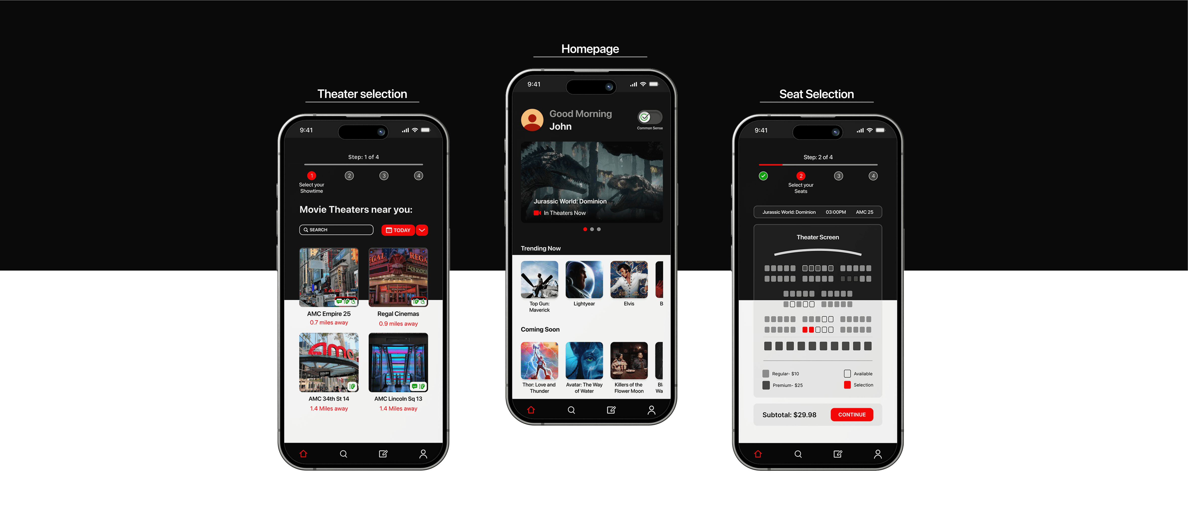
After creating the actionable insights from the second usability study, I started working on the high-fidelity mockups and prototyping what the flow of the app would be like.
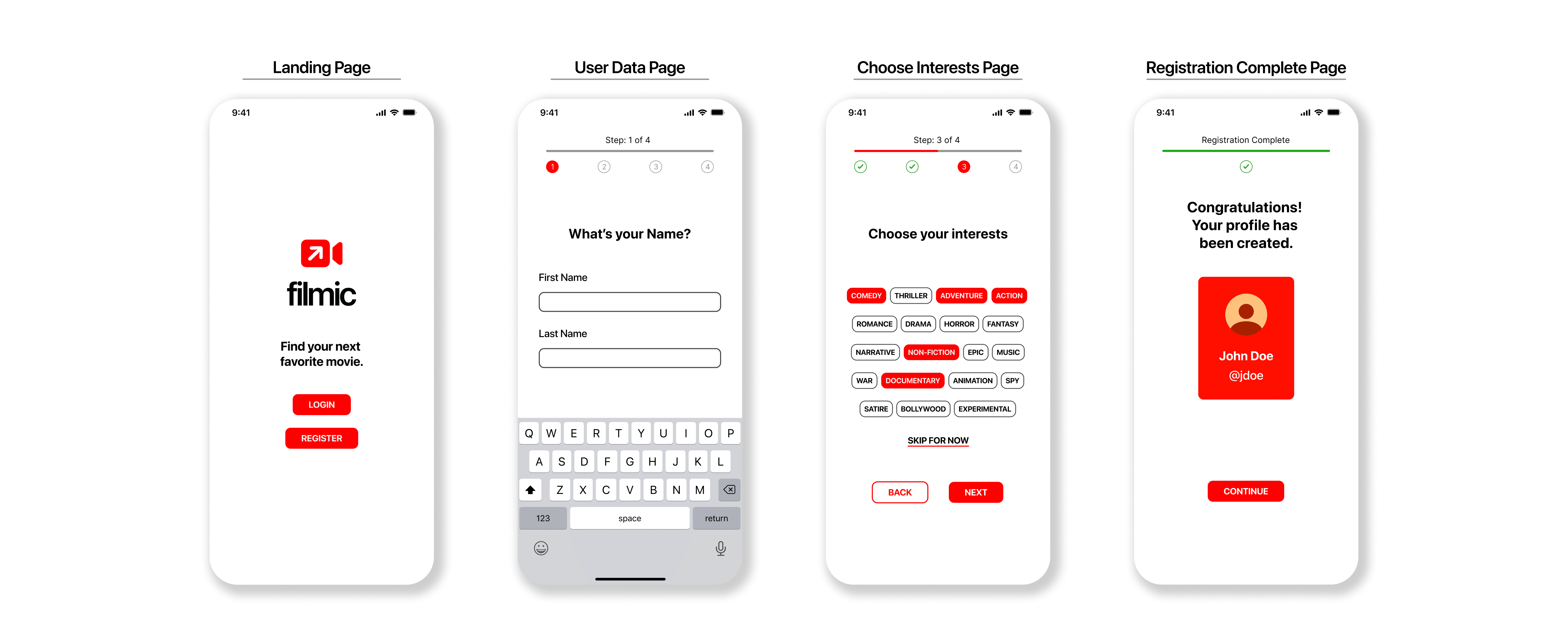
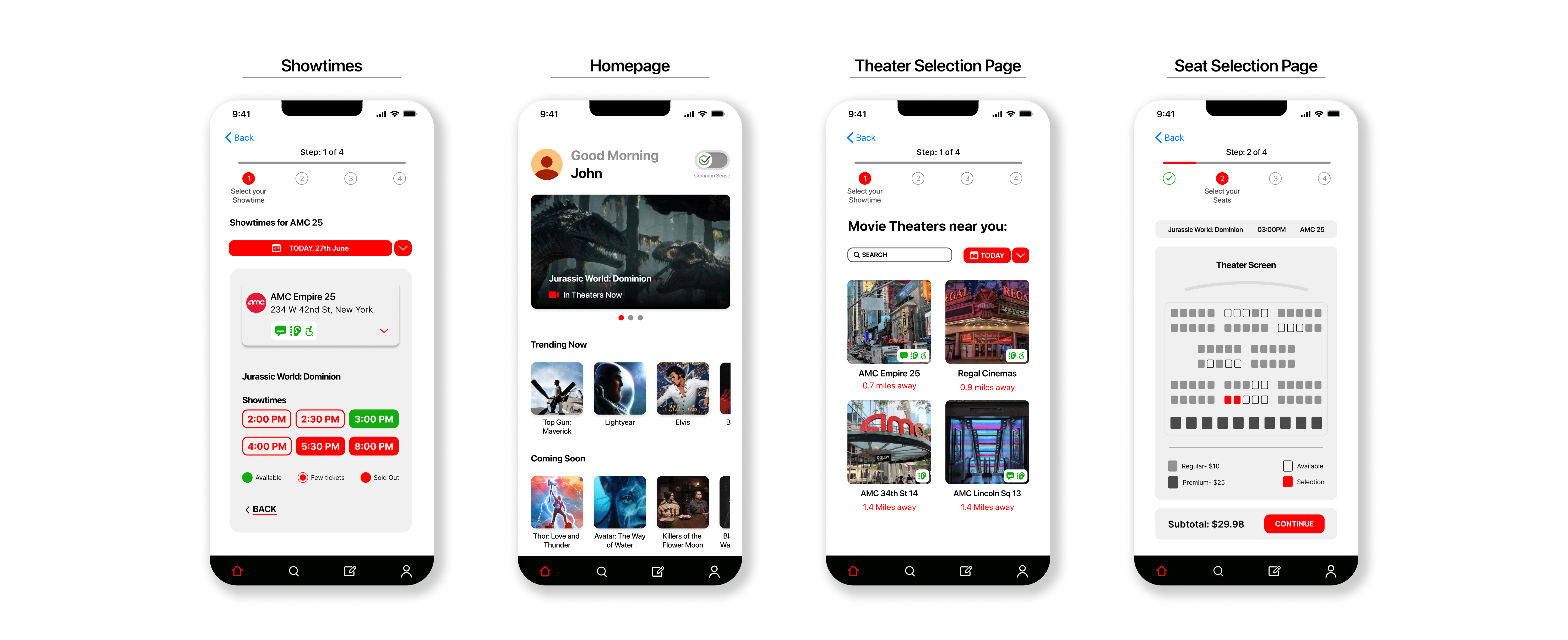
High fidelity prototypes
Reflection
Some of the quantitative feedback that we gathered from the user testing was as follows:
User centered design
Conducting user interviews and usability studies provided valuable insights that guided the design decisions.
Accessibility and inclusivity
Working on this project helped me understand that accessibility is more about equity, not equality.
Intuitive design
This project highlighted the importance of intuitive navigation to keep users engaged and make content discovery seamless.
Next steps
Some of the quantitative feedback that we gathered from the user testing was as follows:
Non-lateral options
Exploration of how non-lateral choices in the interests can lead to more interesting recommendations.
Streaming services
Integration of various streaming services can be a next step given the sheer amount of users and content that is created and curated for web-based streaming.
Social media
Exploration of how a social aspect of this app can evolve and grow. Maybe something like forums could be interesting to bring together people with similar interests.