Dashboard Redesign
Palatial Platforms
Lead Product Designer
(In a team of 8 other cross-functional members)
3 months
Conducting user studies
Stakeholder Management
Working with a cross-functional team
UX Research
UI Design
Figma
FigJam
Google Sheets
Google Forms
Project Overview
Palatial is a SaaS company that offers Technical and Architectural visualization artists to showcase high fidelity, real-time 3D experiences on the web.
This case study focuses on the redesign of Palatial's web dashboard to prepare for an alpha release of their product.
Problem
The current dashboard faces significant usability challenges, including complex workflows and limited options for customization.
These issues prevent developers from efficiently uploading 3D models, necessitating a comprehensive redesign to streamline processes and enhance the user experience.
Approach
Conduct extensive user testing to identify key usability issues. Based on this feedback, develop a prototype focused on balancing functionality and aesthetics.
The goal is to create an intuitive and visually engaging dashboard that simplifies workflows and effectively addresses all identified challenges.
Product goals
Intuitive Interface: Design a user-friendly dashboard with clear and straightforward navigation.
Streamlined Workflows: Simplify processes to enhance efficiency and reduce complexity.
Scalability: Ensure the design supports future feature expansions and integrations.
Enhanced User Experience: Focus on user-centric features to boost overall satisfaction.
Outcome & Impact
These were the end metrics calculated after implementing the redefined dashboard.
85%
Task success rate
100+
User flows created
75%
User satisfaction
20%
Error rate
150
User sign ups generated
70%
Conversion rate
Testimonials
David N.
Level Designer @ PixelCraft
The revamped UI is intuitive and user-friendly, making the onboarding process smoother for new team members. They can now become proficient much more quickly.
Tara O
Senior PM @ Unity
There are similar tools, but Palatial stands out because it's a very intuitive and crafted experience for the viewer.
Jane C.
Principal @ Gensler
You immediately get the design and the journey. For a client trying to understand their space, it would save so much time in the process.
Silvia R.
XR Designer @ Heatherwick Studios
The new dashboard is great for saving time and headache, especially when working with large files.
Alex T.
Senior 3D Technical Artist @ Vertex Studios
Loving the new dashboard! Uploading Unreal Engine files is now so much easier and faster. Huge boost to our workflow!
Lisa C.
Lead Technical Artist @ GameForge
The improved dashboard has streamlined the onboarding process. It's intuitive and user-friendly, enabling new team members to get up to speed quickly and effectively.
Feedback by the CEO and Mithya (external contracting company)
Sign up/Login

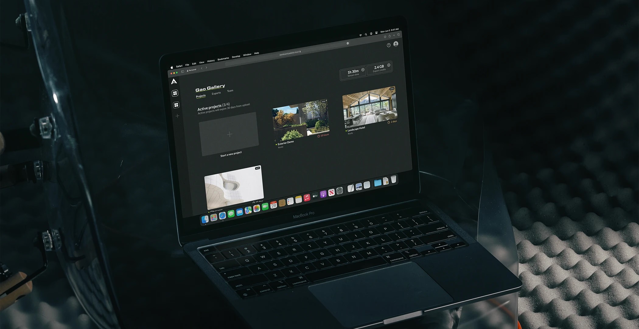
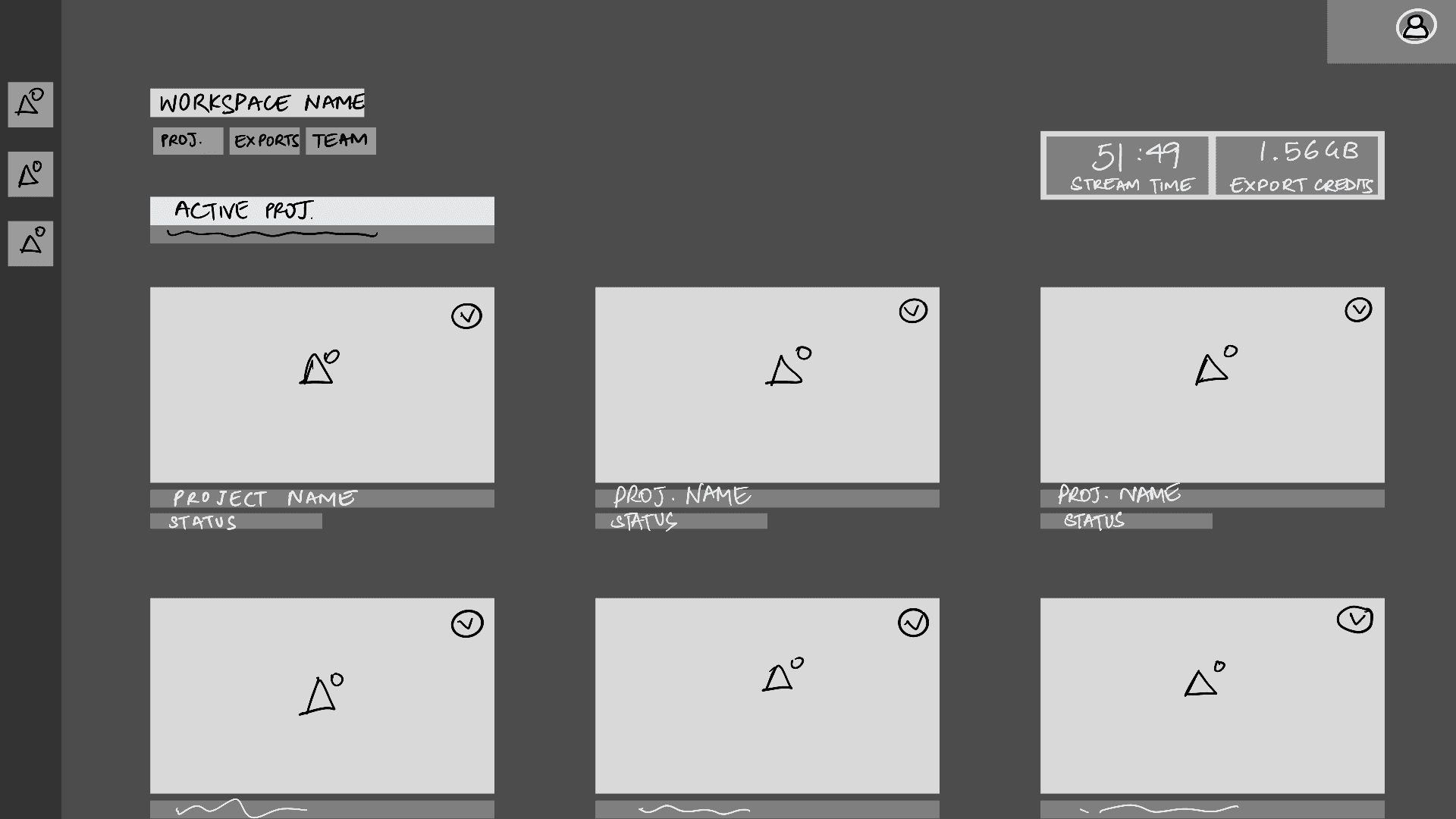
Dashboard
Payments and Billing
Importer
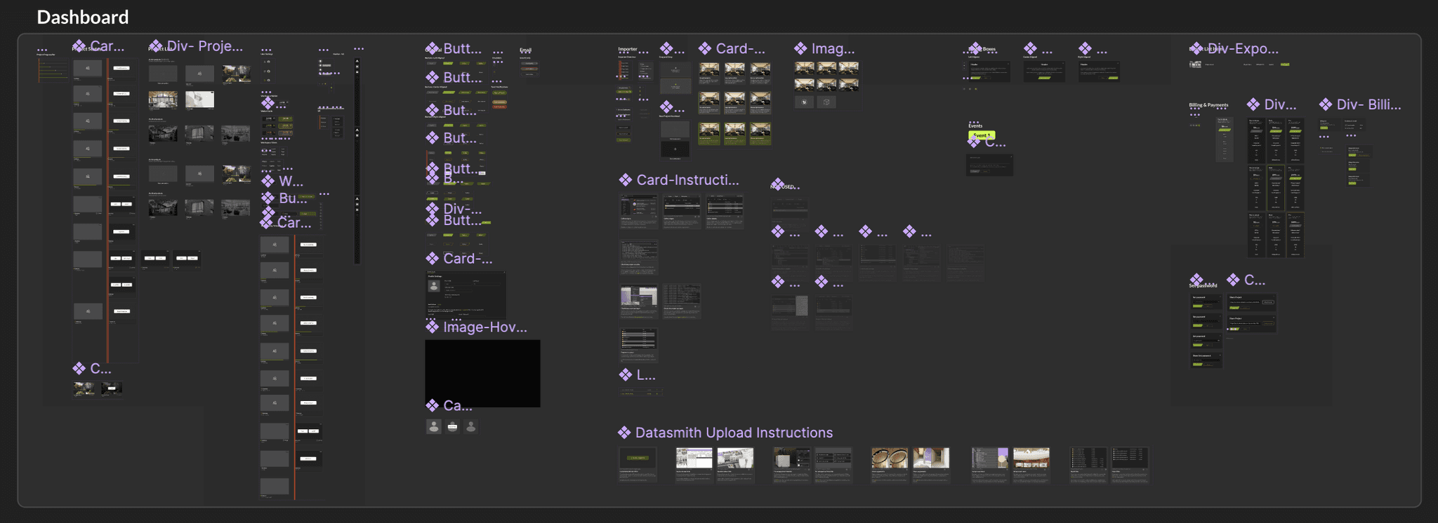
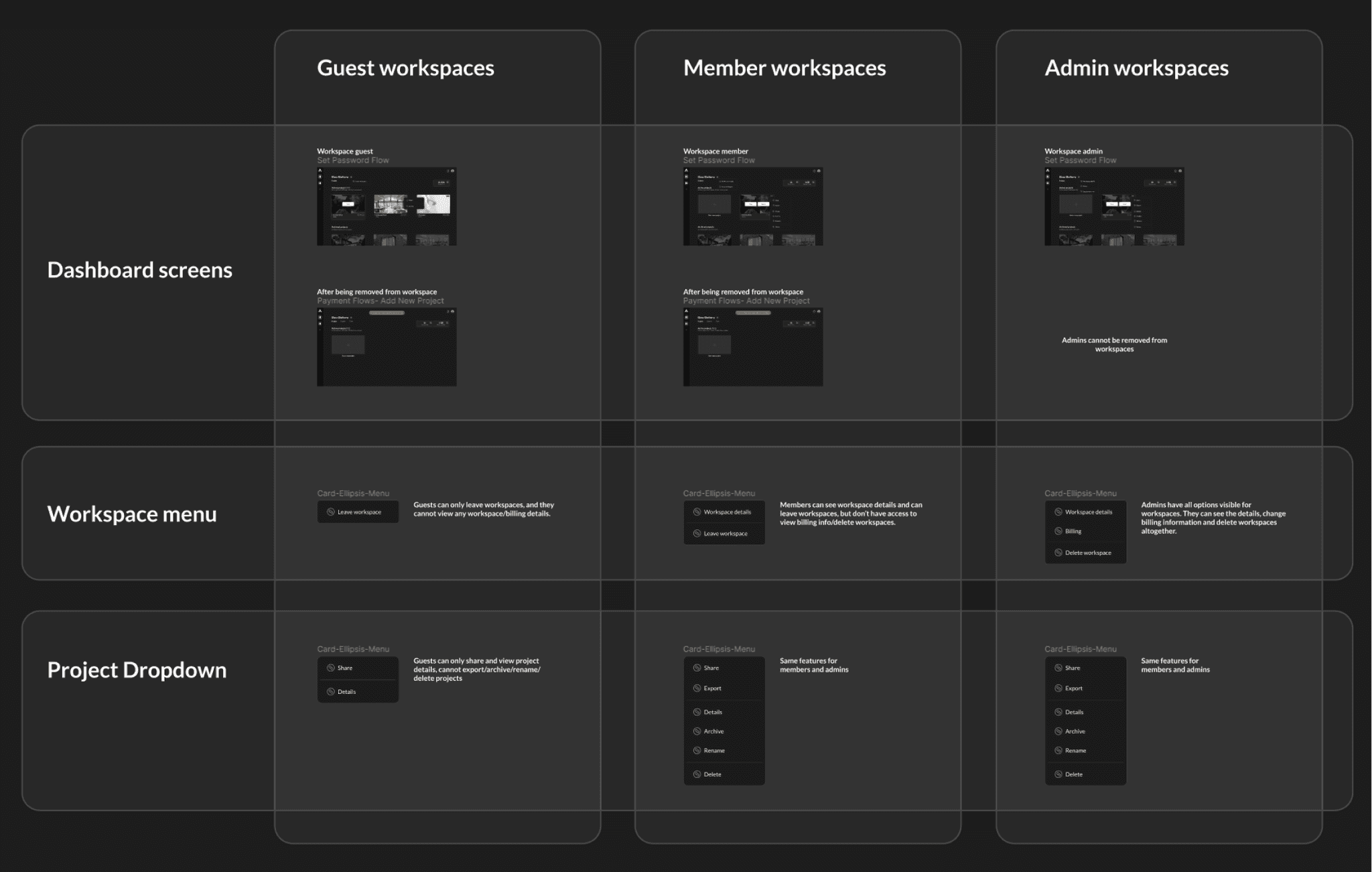
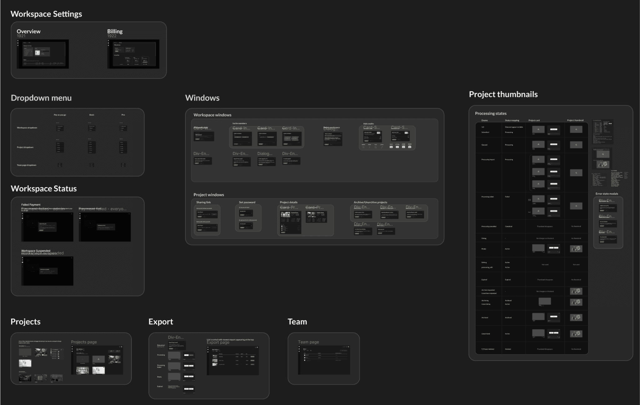
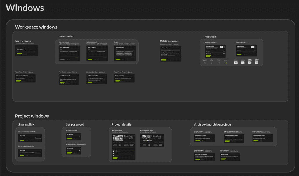
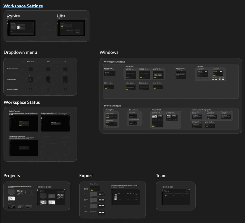
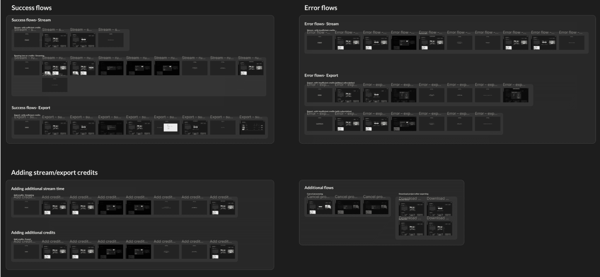
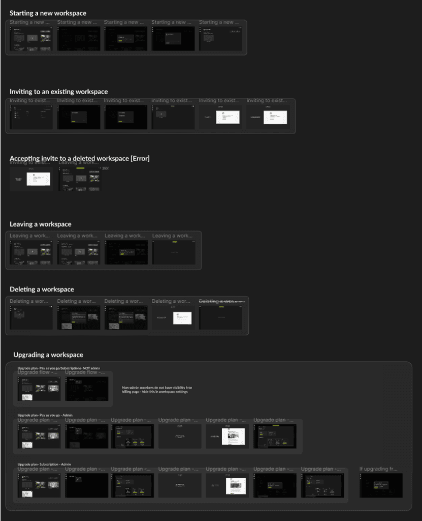
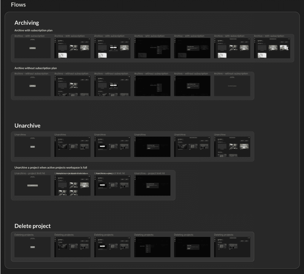
A snippet of the various components and user flows created for this project
Research
When we first worked on creating Palatial's dashboard, the idea was to build an MVP that would be technically capable of uploading projects onto the dashboard and it would work.
Although this was a great start, it wasn't at a stage where all the designs were completely thought through before implementation. The design + development of the first version of Palatial's dashboard was done in 2 months, which wasn't enough time to create a fully working dashboard that was ready for users.
When we had a working prototype ready (V1), I took the lead to test the current designs with a subset of potential users to understand areas of improvement and what pain points the users were facing.
User testing
I conducted comprehensive usability testing with approximately 20 participants, including both new users and those familiar with Palatial's previous dashboard.
This user research provided valuable insights through heuristic evaluations and user behavior analysis, allowing me to identify key usability issues and inform iterative design improvements for the dashboard redesign.
To get qualitative & quantitative feedback, we created two different tests:
Moderated Front-end testing for design feedback.
Unmoderated Back-end testing for developer feedback on potential bugs and areas of improvement.
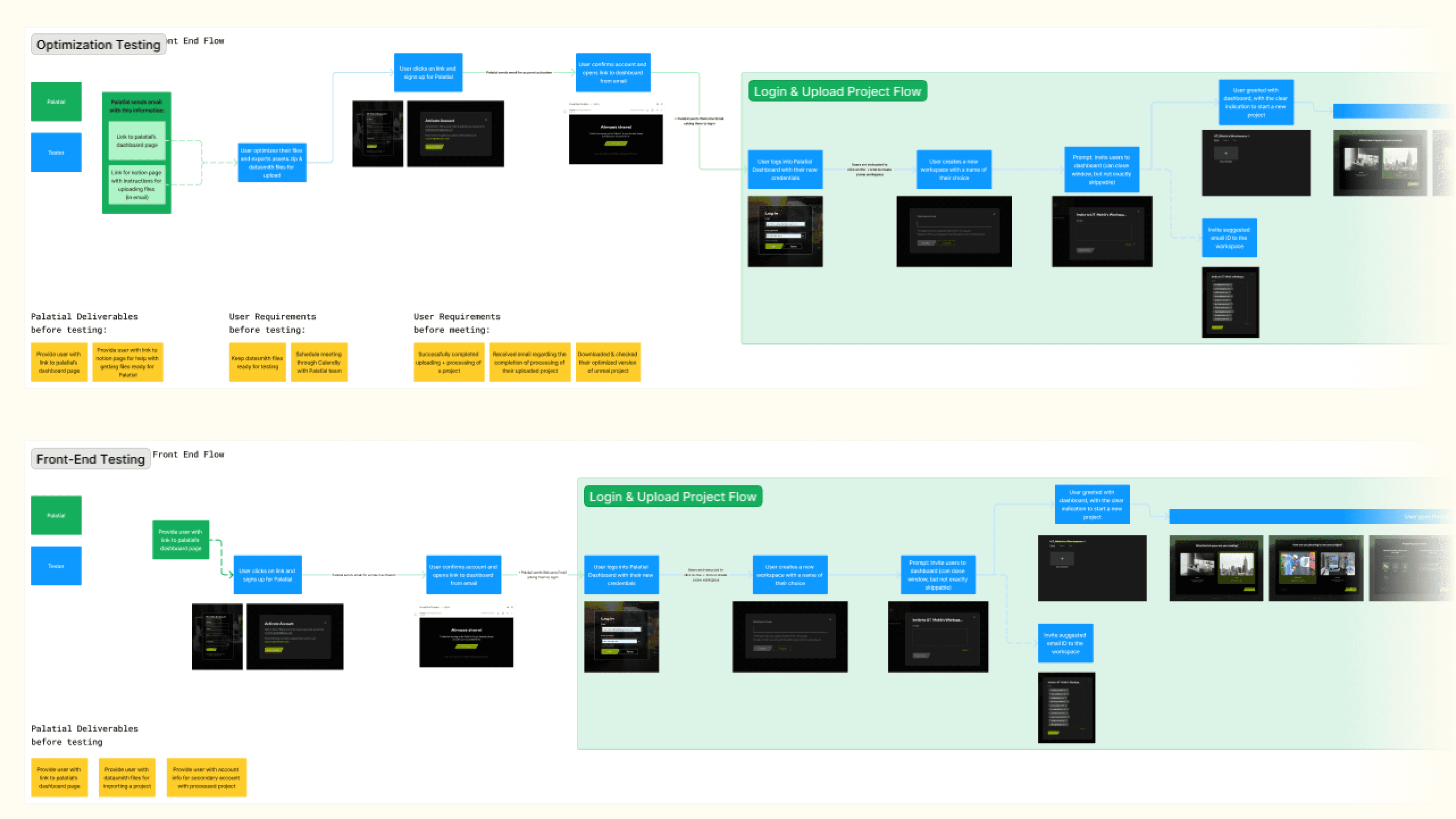
User testing flows
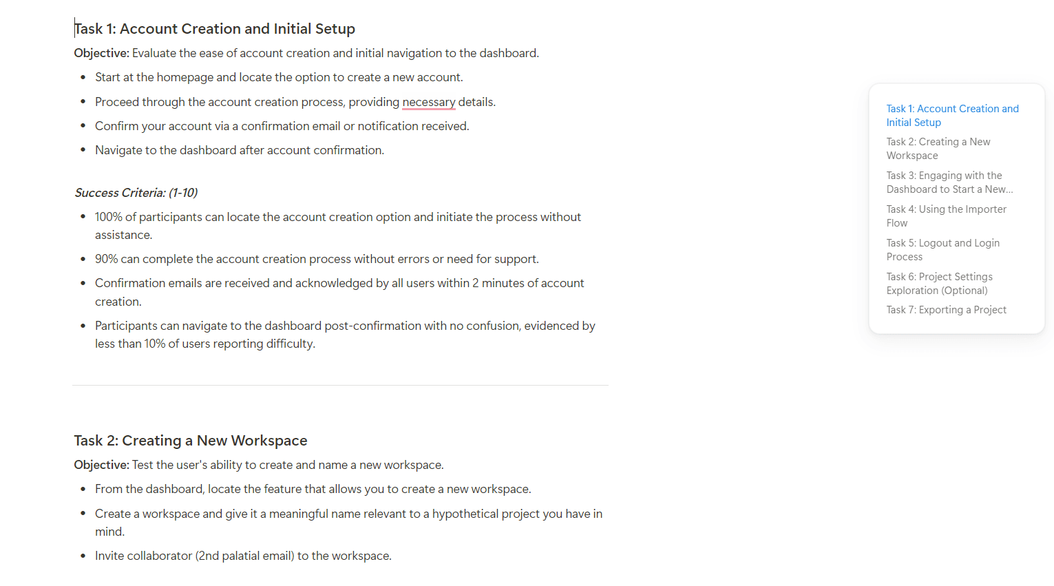
User testing questions
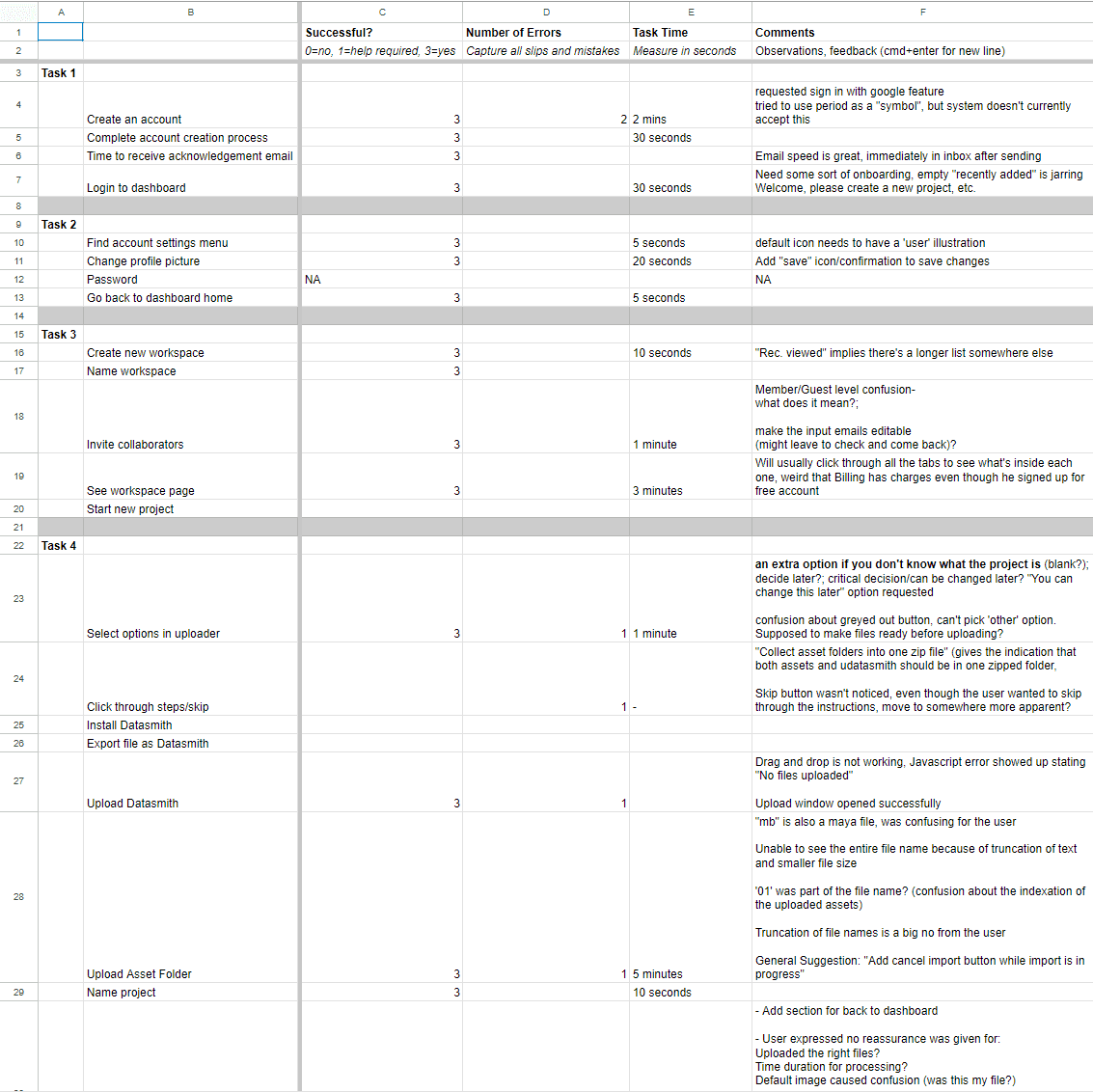
Gathering data from usability tests
Analysis
Analyzing feedback from our user research unveiled consistent usability issues and unforeseen challenges.
This qualitative analysis highlighted recurring pain points and user experience gaps, underscoring the need to refine the dashboard's information architecture and interaction design
Key findings
Some of the quantitative feedback that we gathered from the user testing was as follows:
Unintuitive interface
Many users found the UI unclear, with navigation steps that were not straightforward.
Unable to complete tasks
Approximately 40% of users struggled to complete tasks successfully.
Low satisfaction rates
Around 40% of users reported difficulty in completing tasks, leading to lower satisfaction rates.
Importer details locked
Users were unable to move forward/back while their files were uploading, leading to restart the importer process.
Strict sign-in requirements
There was no option to login with SSO, and password requirements were very strict to continue with account creation.


Analysis based on initial moderated usability studies
Process
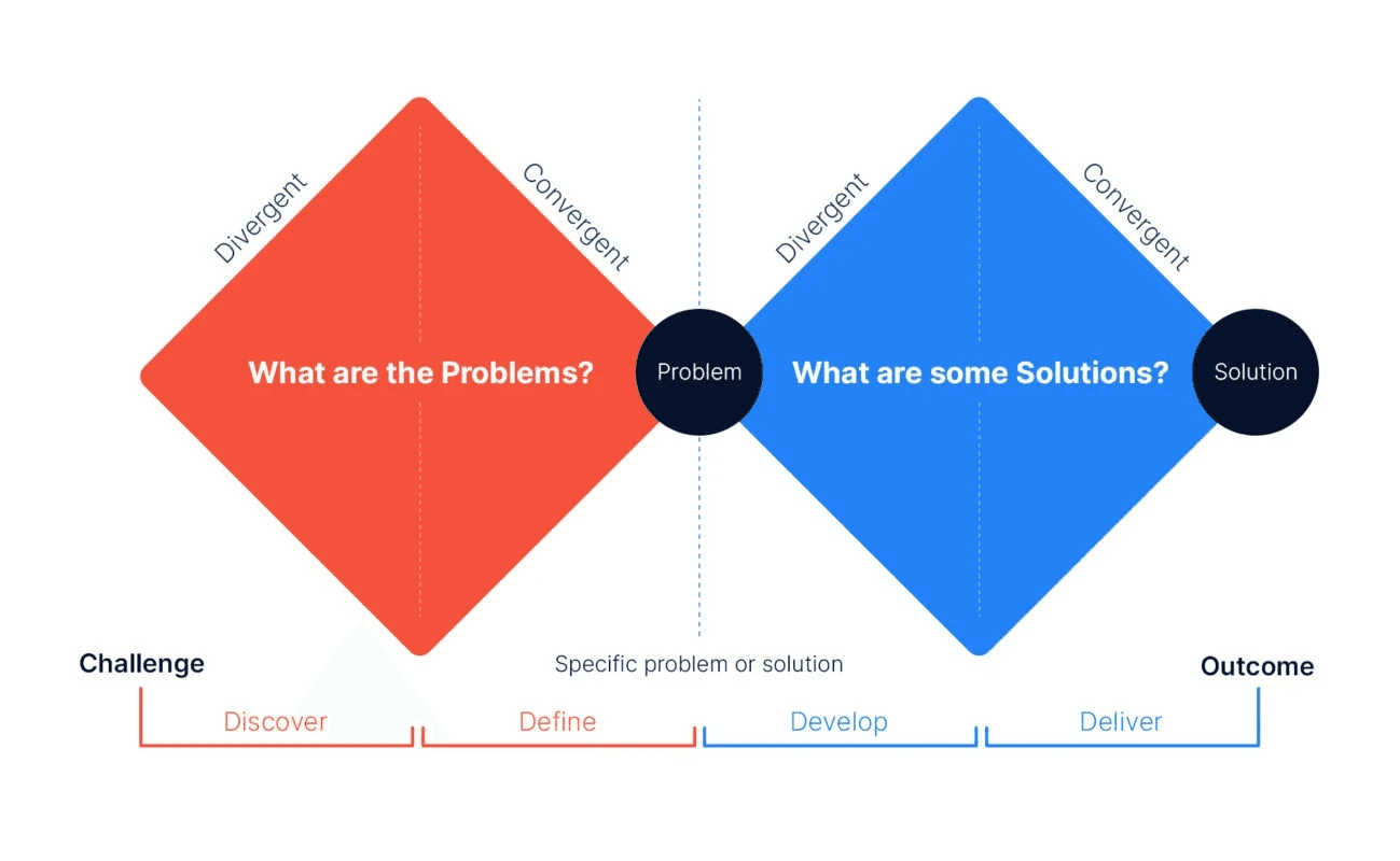
Even while moving at a fast pace, we naturally followed the Double Diamond process - discovering user needs, defining problems, developing solutions, and delivering results efficiently. This approach kept our design user-focused and effective despite tight deadlines.
Once we had the core designs in place, I followed the Agile UX process by conducting weekly sprints to iteratively design and develop new features.
For this project, our process followed the Double Diamond model, which focuses on four key phases: Discover, Define, Develop, and Deliver. We began by conducting user research to uncover challenges and needs, then synthesized this information to clearly define the problems to address.
In the Develop phase, we explored various design solutions through ideation and prototyping, refining our approach based on user feedback. Finally, we delivered a refined and user-centered dashboard solution that improved usability and streamlined workflows.
Wireframing and Ideation
I had multiple meetings with technical team, engineering team, the product manager and the CTO for various features that we needed to implement.
Since this was a large project with very little time to accomplish the end goal, not a lot of the frames were taken from ideation to production in a linear manner. We did go through whiteboard sessions for the dashboard, which is on the right here.
Most of the explorations here happened directly inside of the high fidelity prototypes.
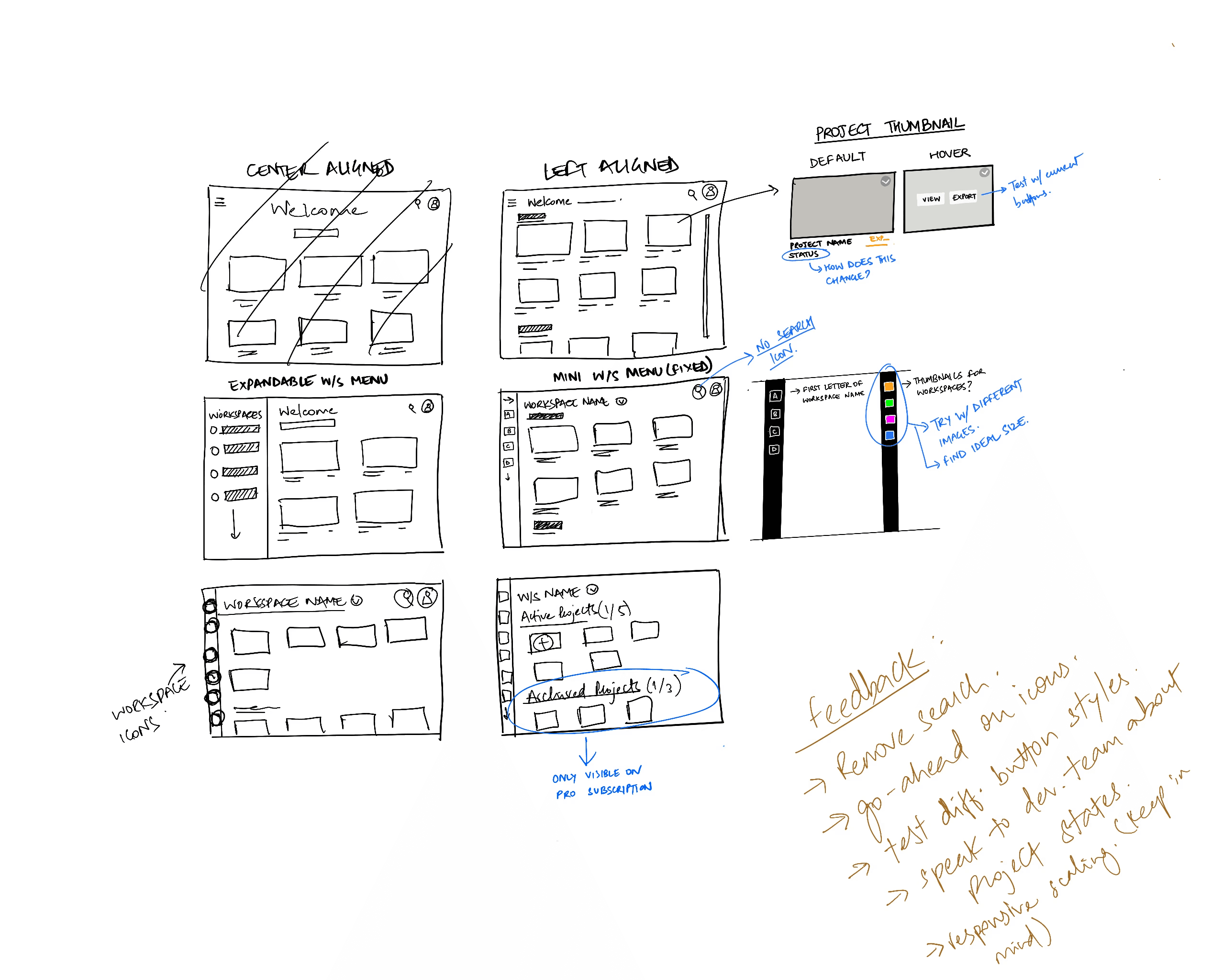
Initial sketching explorations
Iterative low fidelity wireframes
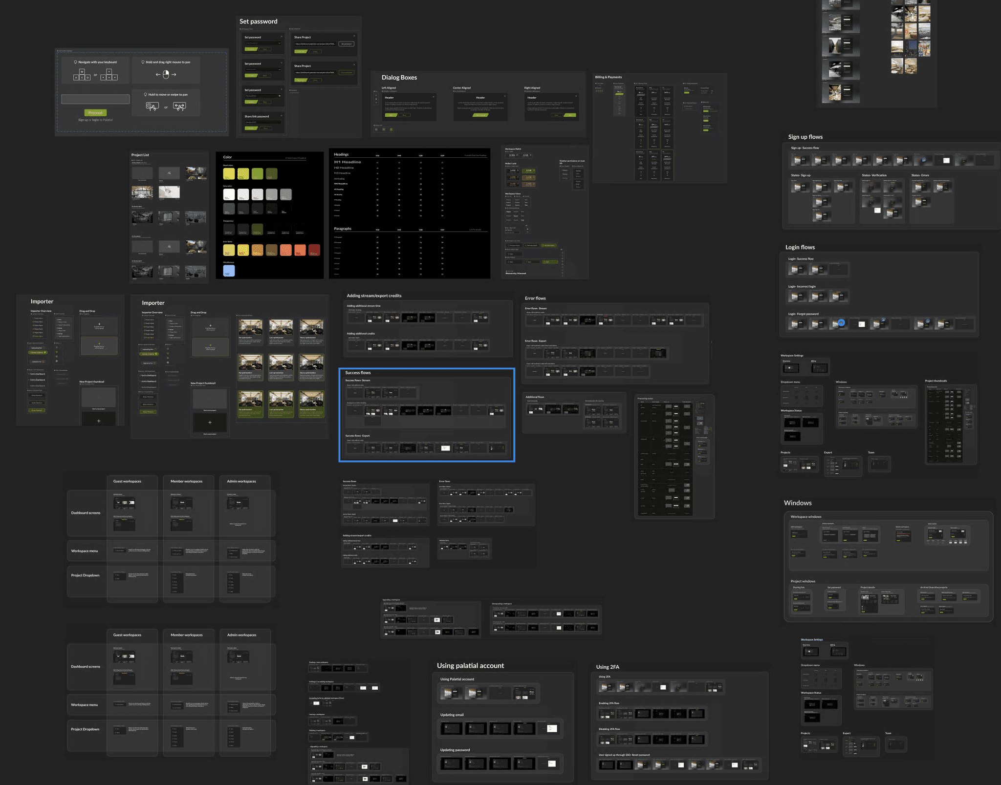
High fidelity explorations
Video - New Dashboard
Major changes
Although the redesigned dashboard had over 40+ changes and new features implemented, these were the major changes that were made:
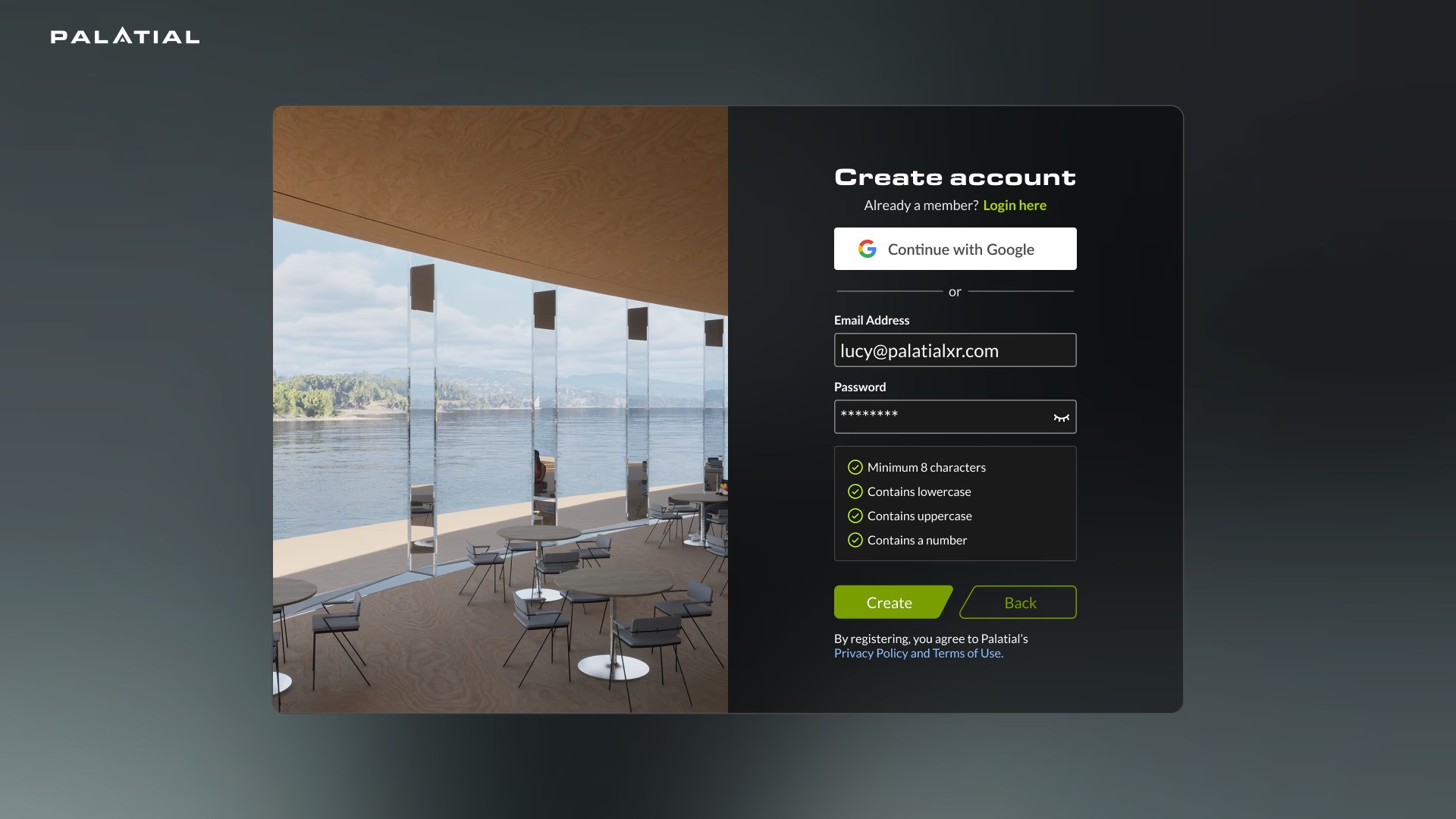
Overhaul of sign up / login page
For the second round of the dashboard design, we took the efforts to create a comprehensive and robust sign up and login system.
Problem area
Users expressed an interest to have multiple login options for signing into palatial.
Users pointed out that the password requirements had limited permissible characters.
Users pointed out problems with legibility on the password requirements section.
Solution
Designed a robust login system + SSO support with error states for various edge cases that may come up.
Created an interactive password input system that tells them the password requirements.
Added icons to the password requirements section with improved contrast for better legibility.
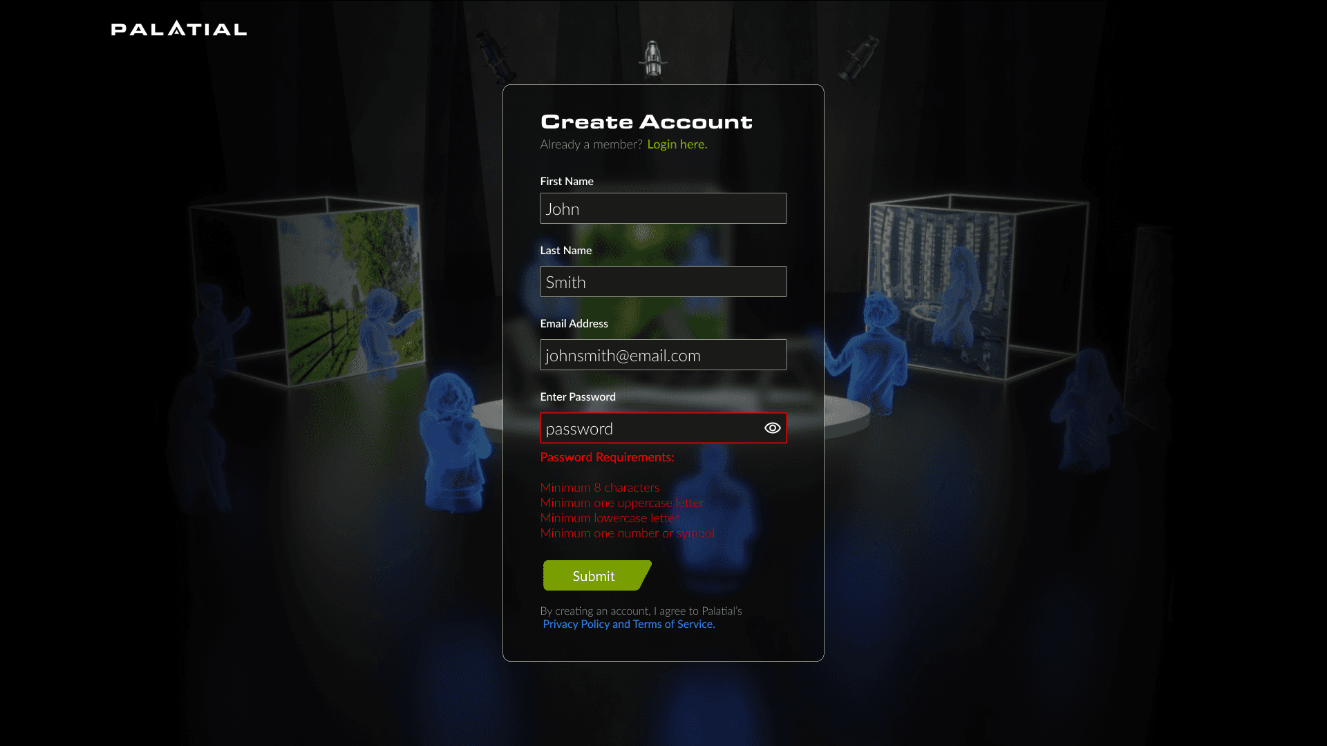
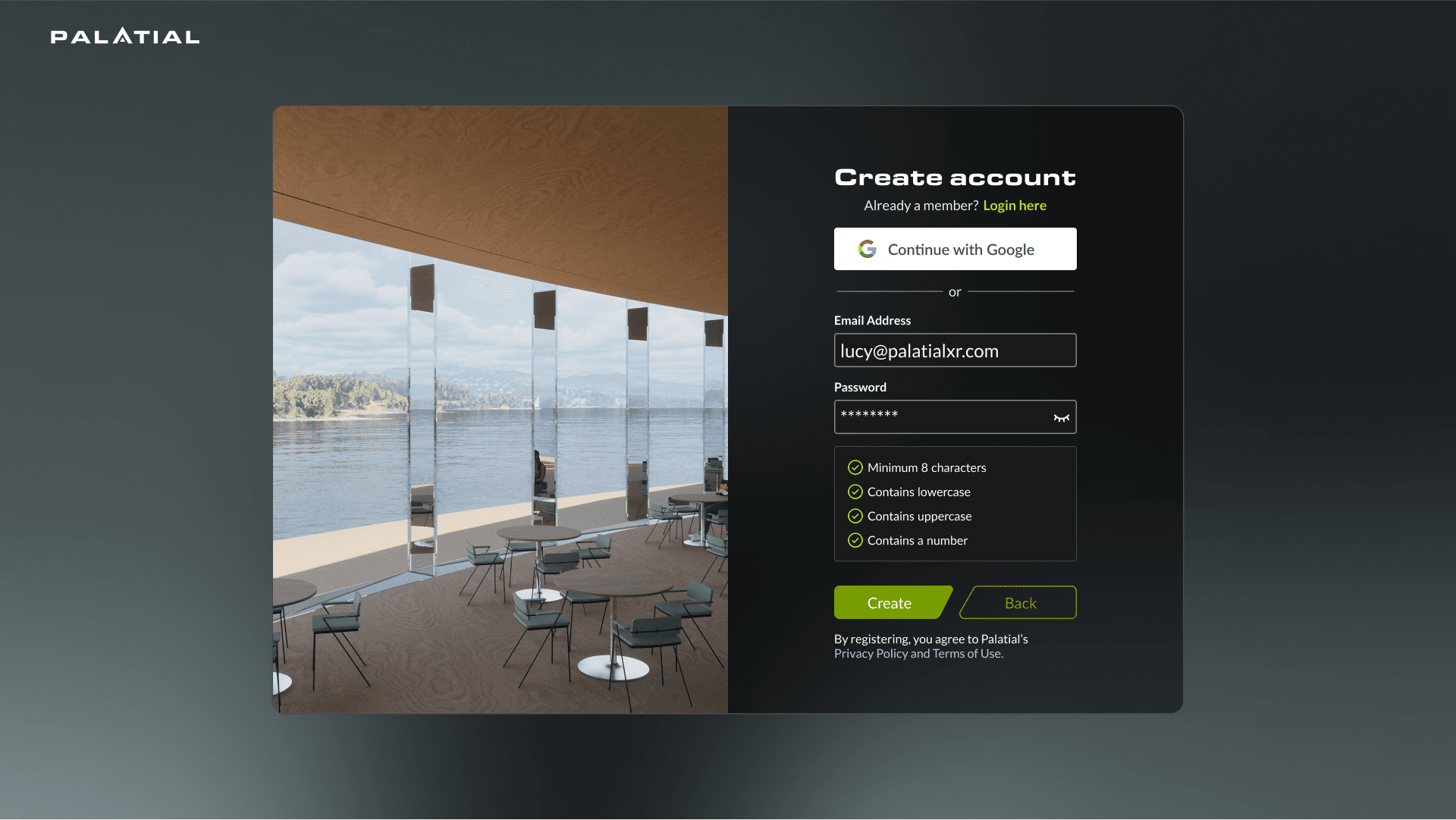
Before/After - Sign up page
Adding an onboarding experience
For the second round of the dashboard design, we took the efforts to create a comprehensive and robust sign up and login system.
Problem area
Initially we predicted that the users would know what to do once they log into the dashboard, but after user testing we learned that there were a lot of confusions regarding next steps.
Solution
Created an onboarding experience explaining the various features of Palatial, as well as including a personalized workspace so users can begin to upload their projects for optimization.
Video - Onboarding process
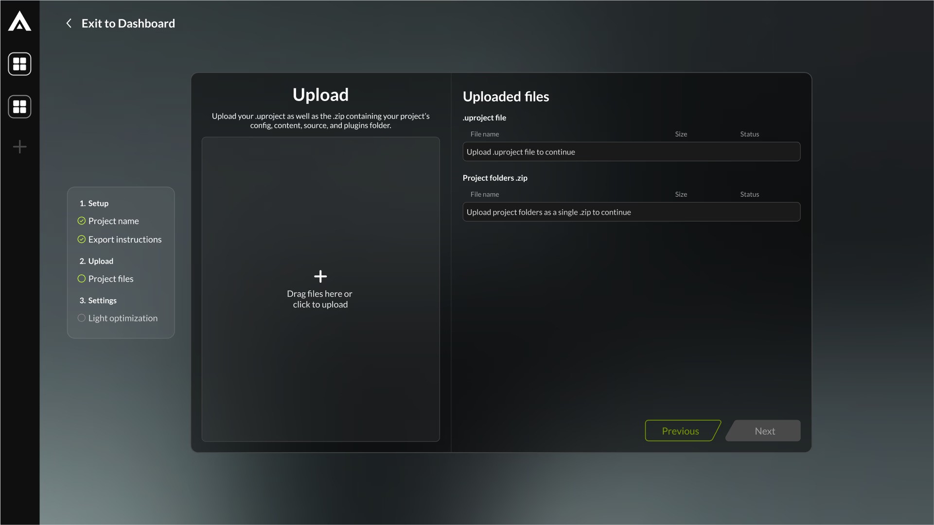
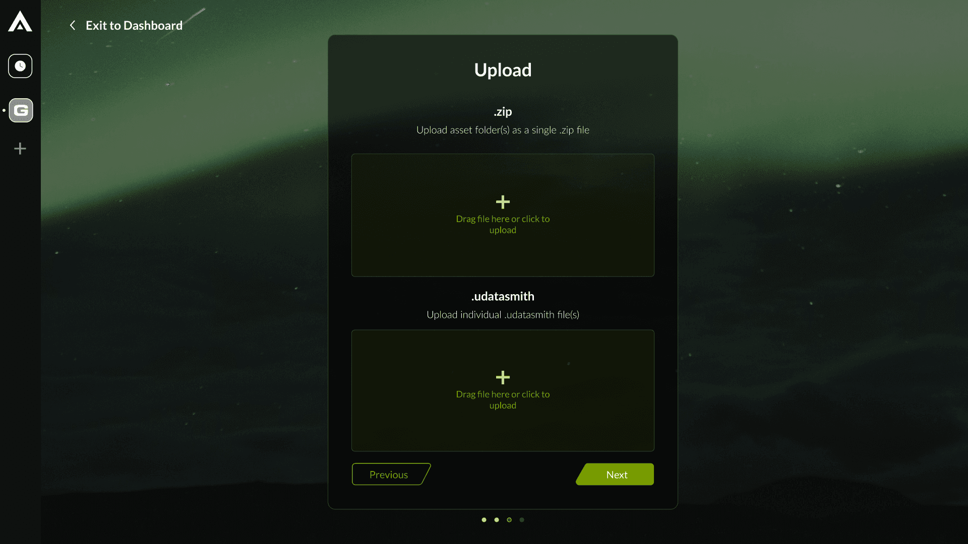
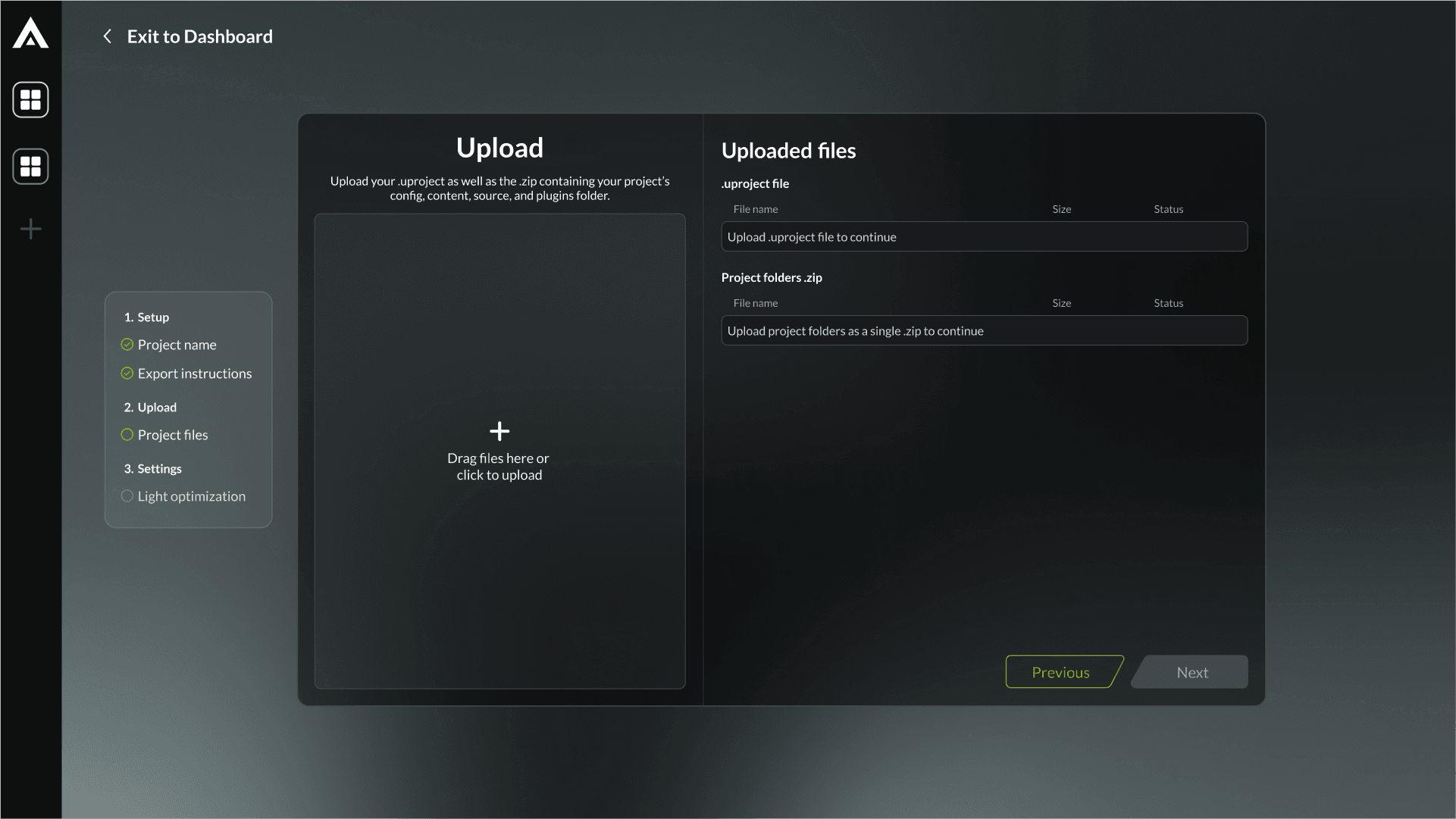
Changing how users upload projects
Based on the user feedback, we understood the cognitive patterns that were being missed in earlier iterations and were able to redefine the importer process to make it more flexible and streamlined for everyday use.
Problem area
A lot of steps were involved in uploading a project onto the dashboard.
Users were unable to go back in the uploader to make changes to their upload settings.
Multiple drag & drop windows created confusion and distress (especially since files were being dragged from another window).
40% of users expressed distress in the overall flow of the uploader and found it too complex for everyday use.
Solution
Understand the core functionality of the importer and simplify.
Speak with developers to figure out a way to have files upload in the background to move forward/back.
Create one drag and drop window to allow users to upload all files at once.
Create an overview window for visibility of where the users are in the upload process.
Before/After - Sign up page
Video - Uploading a project
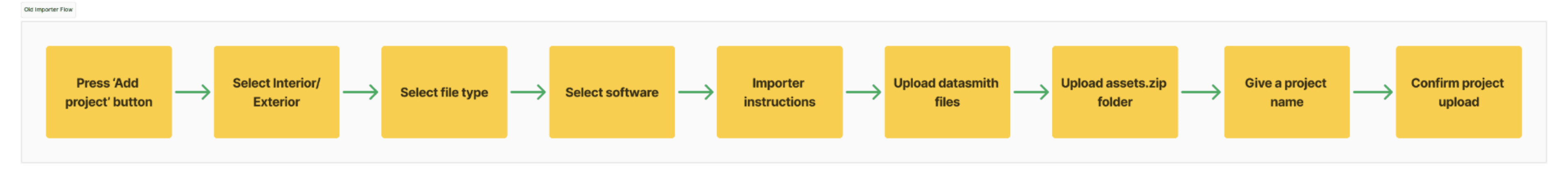
Importer - Old Flow
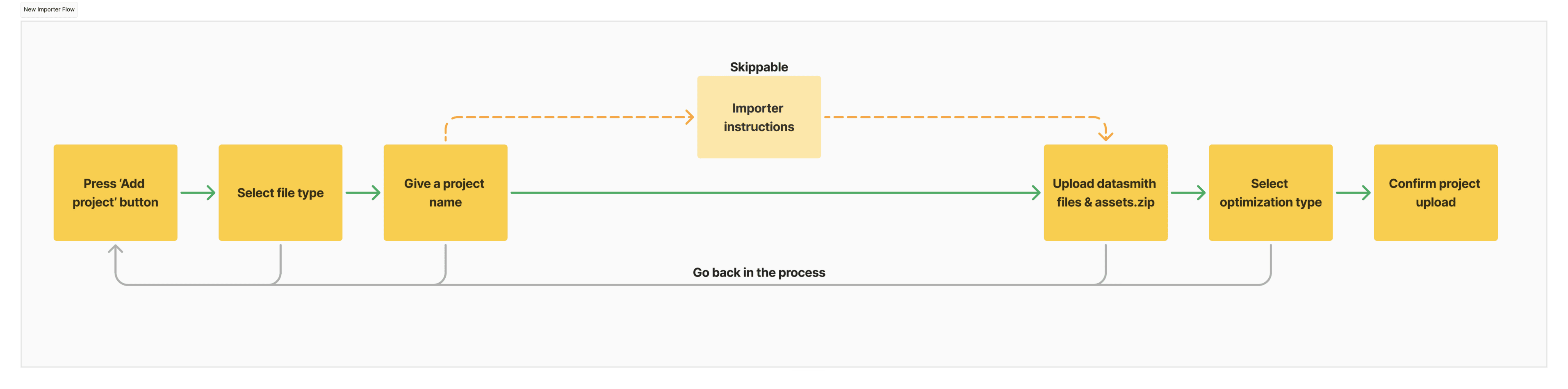
Importer - New Flow
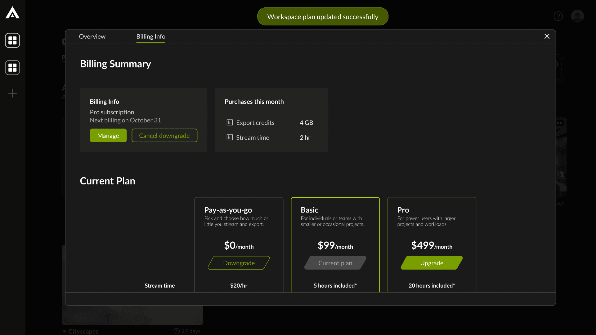
Stripe Integration
One of the major functionalities that we wanted to add was Stripe integration to allow users to be able to stream, export and download their optimized projects.
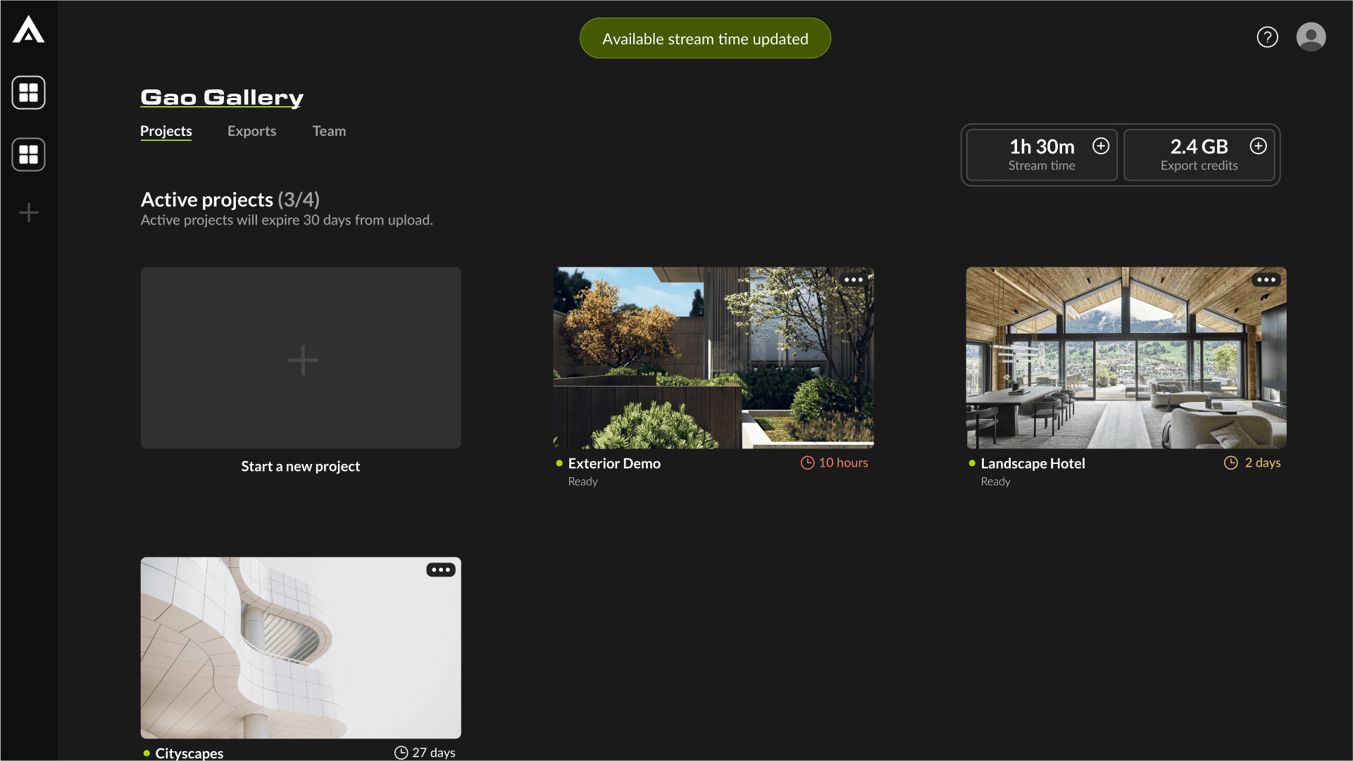
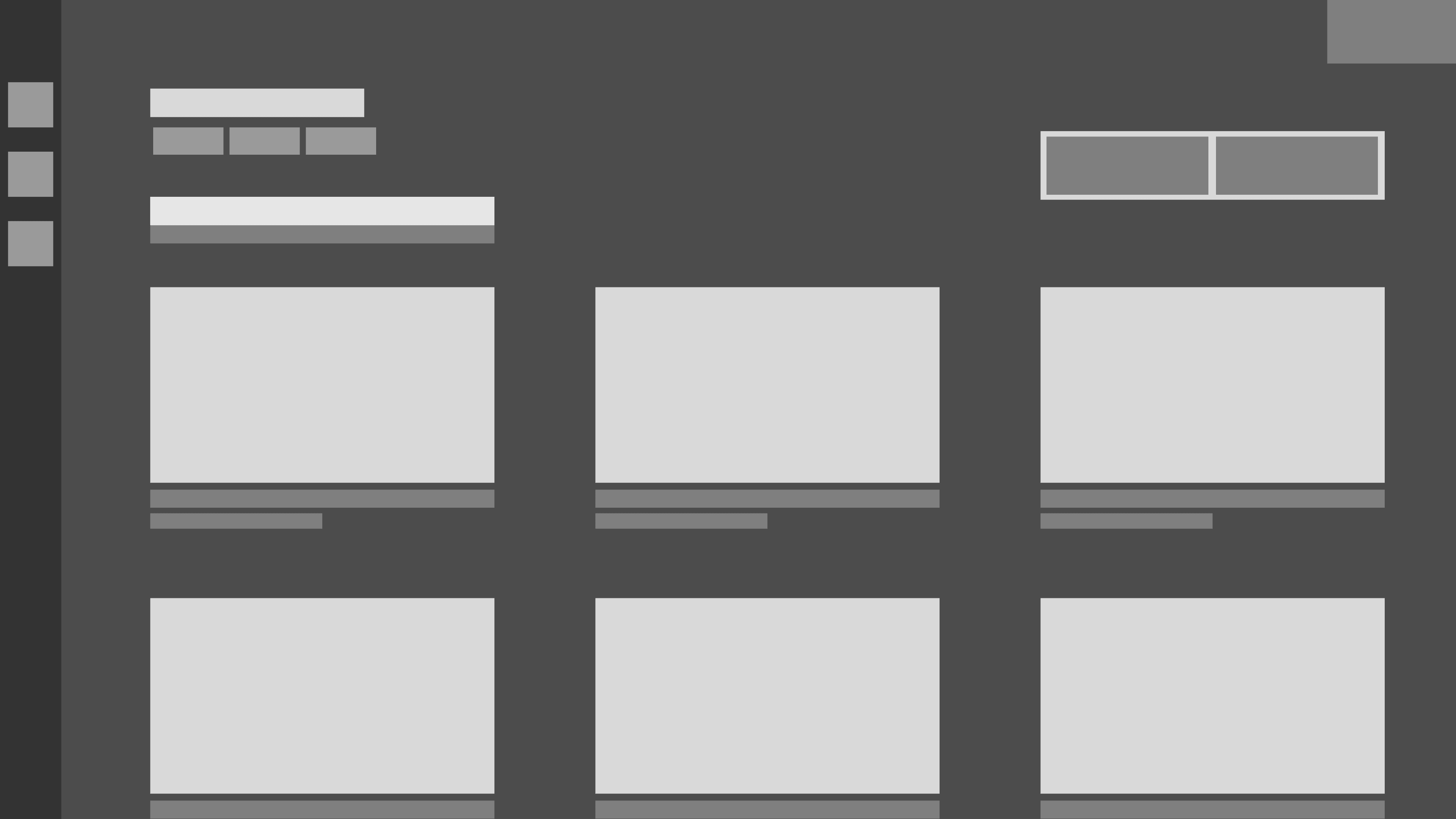
Main dashboard
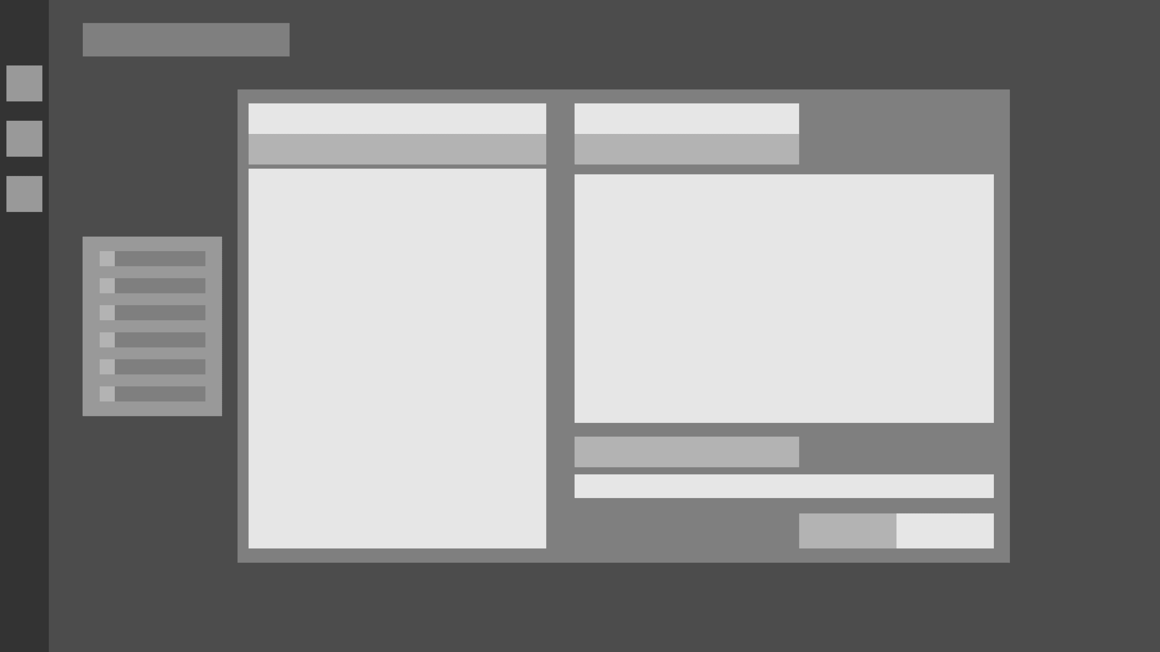
Subscriptions and billing
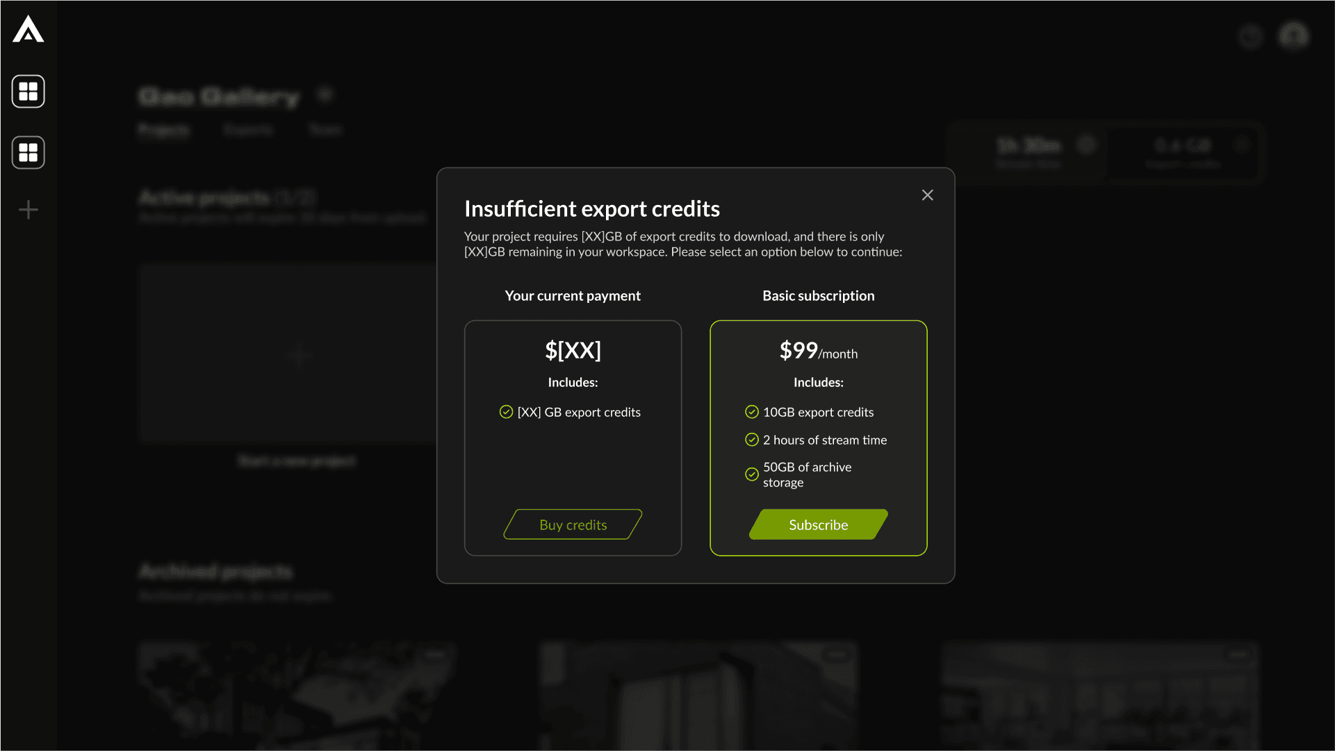
Upgrade plan modals
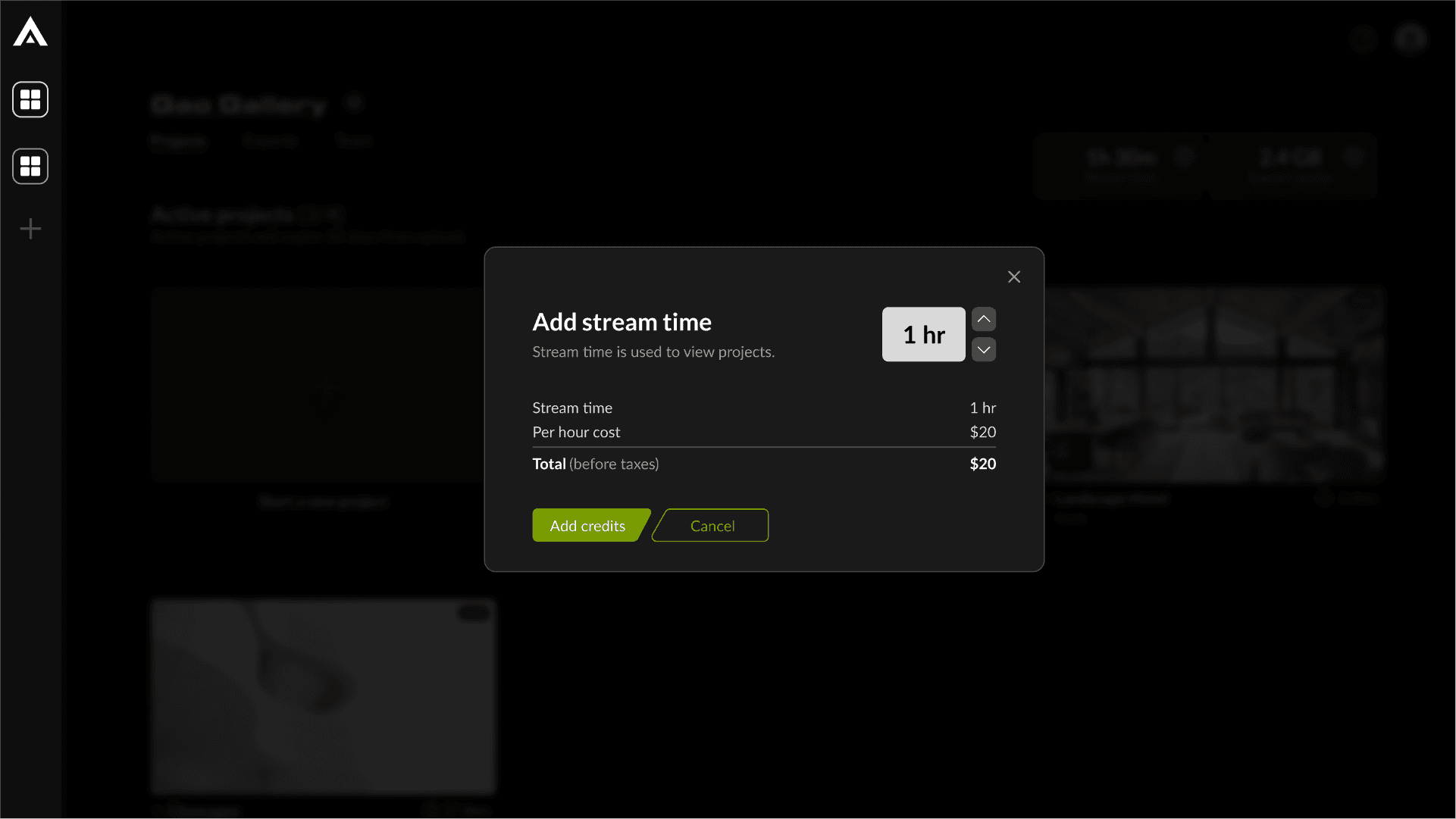
Add stream/export credits modals
Learnings and reflection
After conducting a second round of testing with the same user group, we observed improvements across all user metrics. Users appreciated the enhancements in V2 of the dashboard, noting a significantly better experience.
While there remains room for further improvement, these metrics demonstrate that the redesign successfully enhanced the user experience for the dashboard.
Key learnings
Importance of early user research
Extremely important to do research early on to understand what target audience we're designing for.
Comprehensive design system
Having a solid design foundation for a brand is necessary for faster development of new features.
Collaboration across cross-functional teams
Having early conversations with cross-functional team members was vital to making sure the new features work as intended.
Iterative feedback based development
Getting user feedback early on in development helps in designing solutions for real problems.