UI/UX Designer
4 weeks
Conducting user interviews
Paper and Digital wireframing
Data gathering and analysis
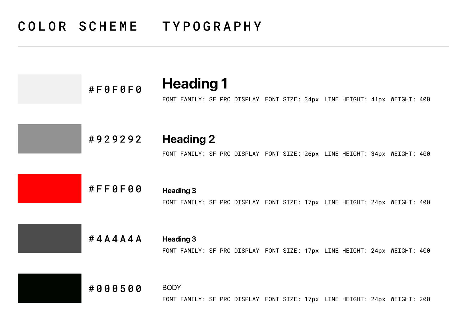
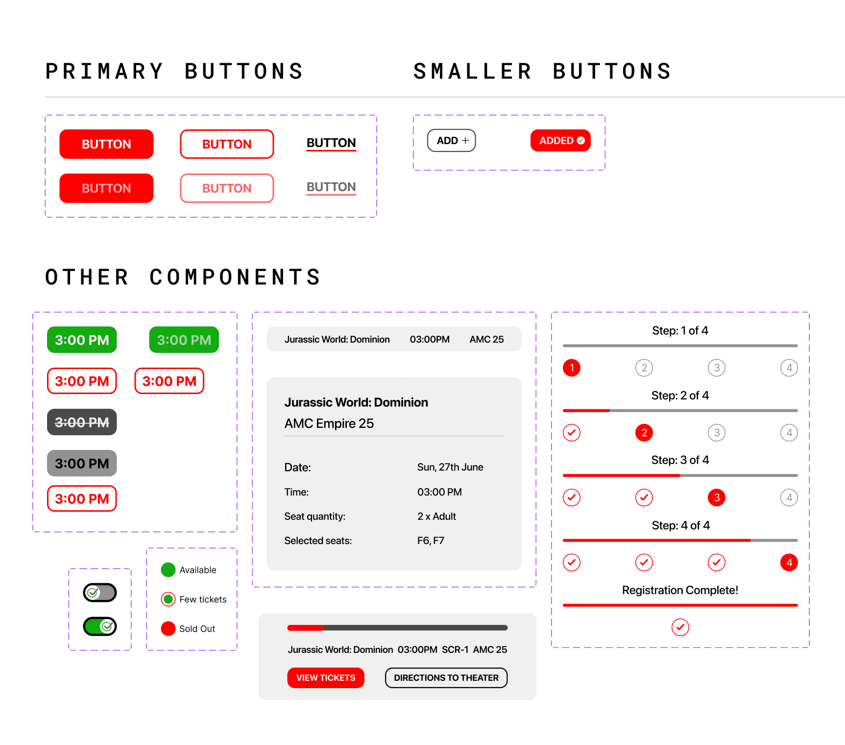
Creating the design system
Figma
Figjam
Adobe creative suite
Project Overview
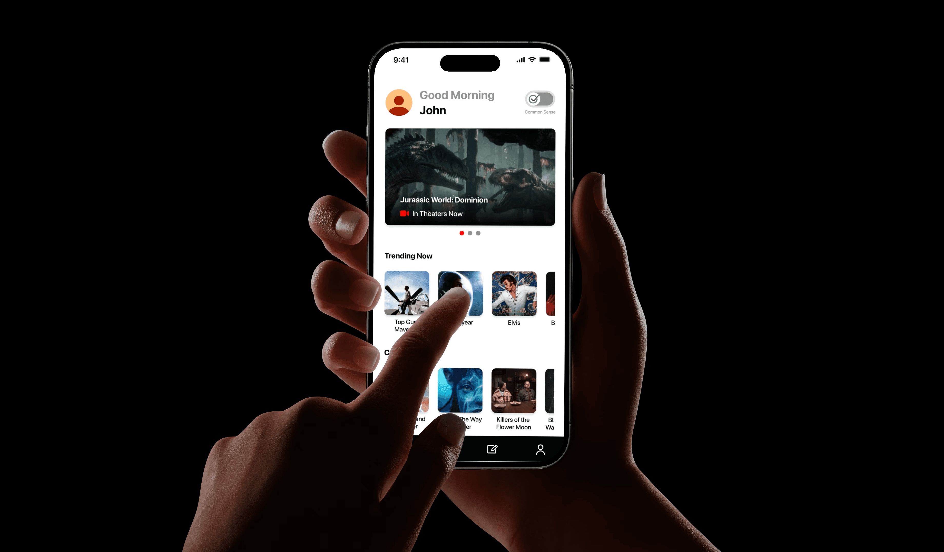
In today’s world, the amount of distractions that we have are endless. Imagine trying to look for a movie to watch, you click on a trailer and before you know it, you’re 45 minutes into watching cute cat videos. This is a pretty problematic. Enter Filmic.
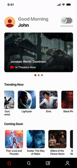
Filmic is an iOS app that was created for viewing movie trailers and booking tickets, all in one place. It takes you from trailer to theater in record time.
Problem
Users frequently struggle with navigating multiple applications to complete the process of viewing trailers and purchasing tickets.
Outcome & Impact
These were the end metrics calculated after implementing the redefined dashboard.
85%
Task success rate
15%
Error rate
75%
User satisfaction
70%
Conversion rate
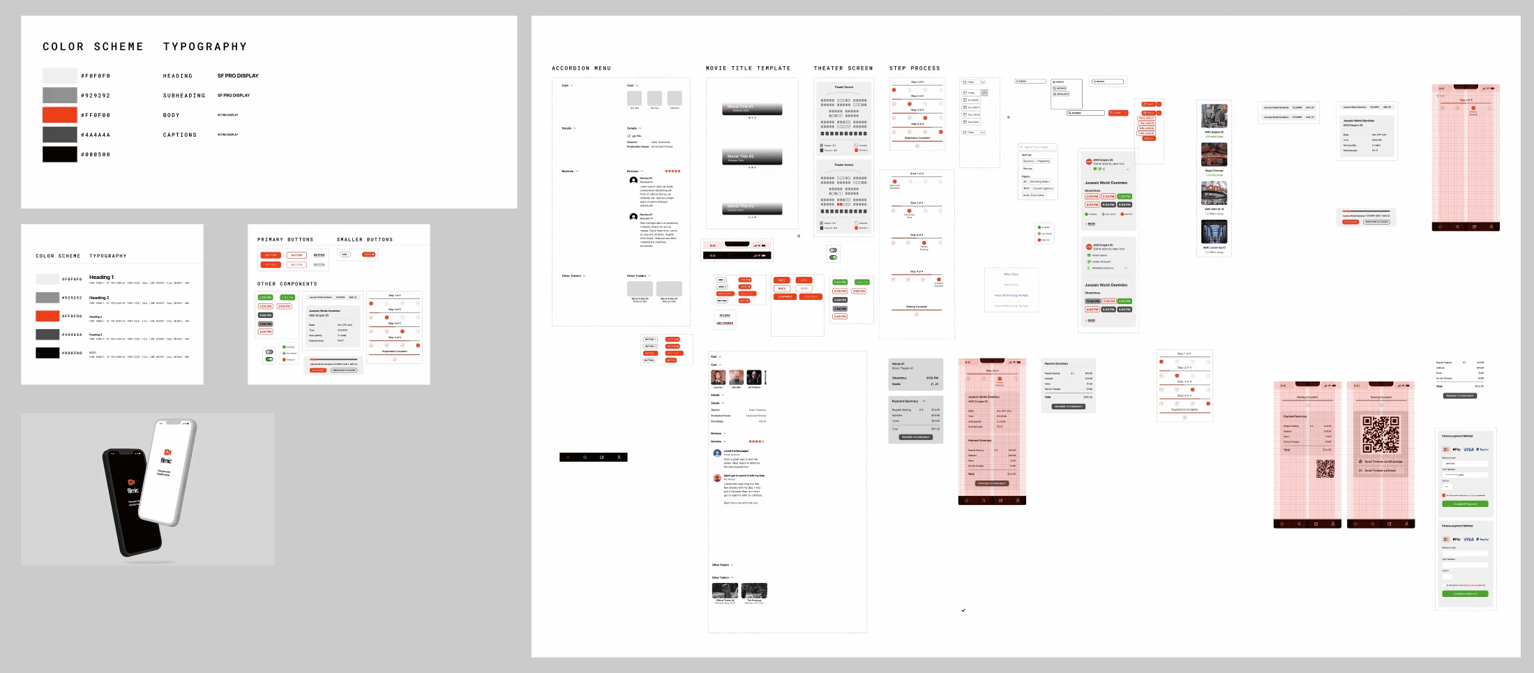
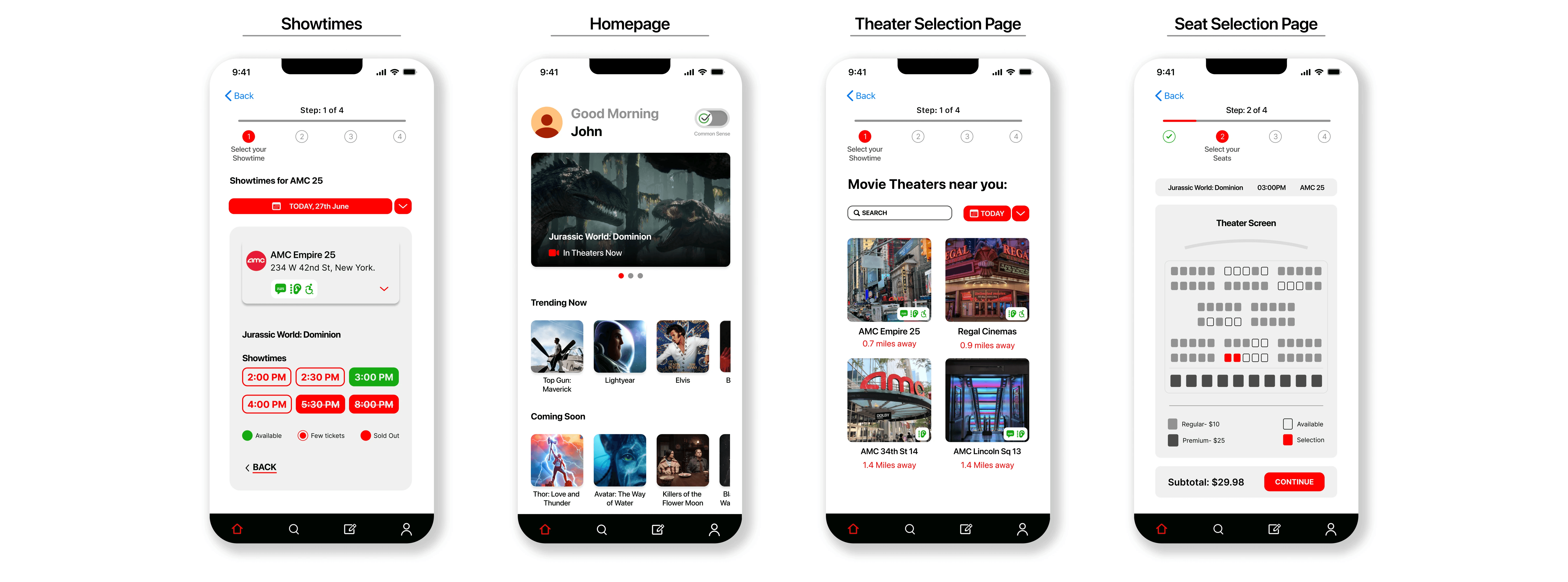
High fidelity prototype
Research
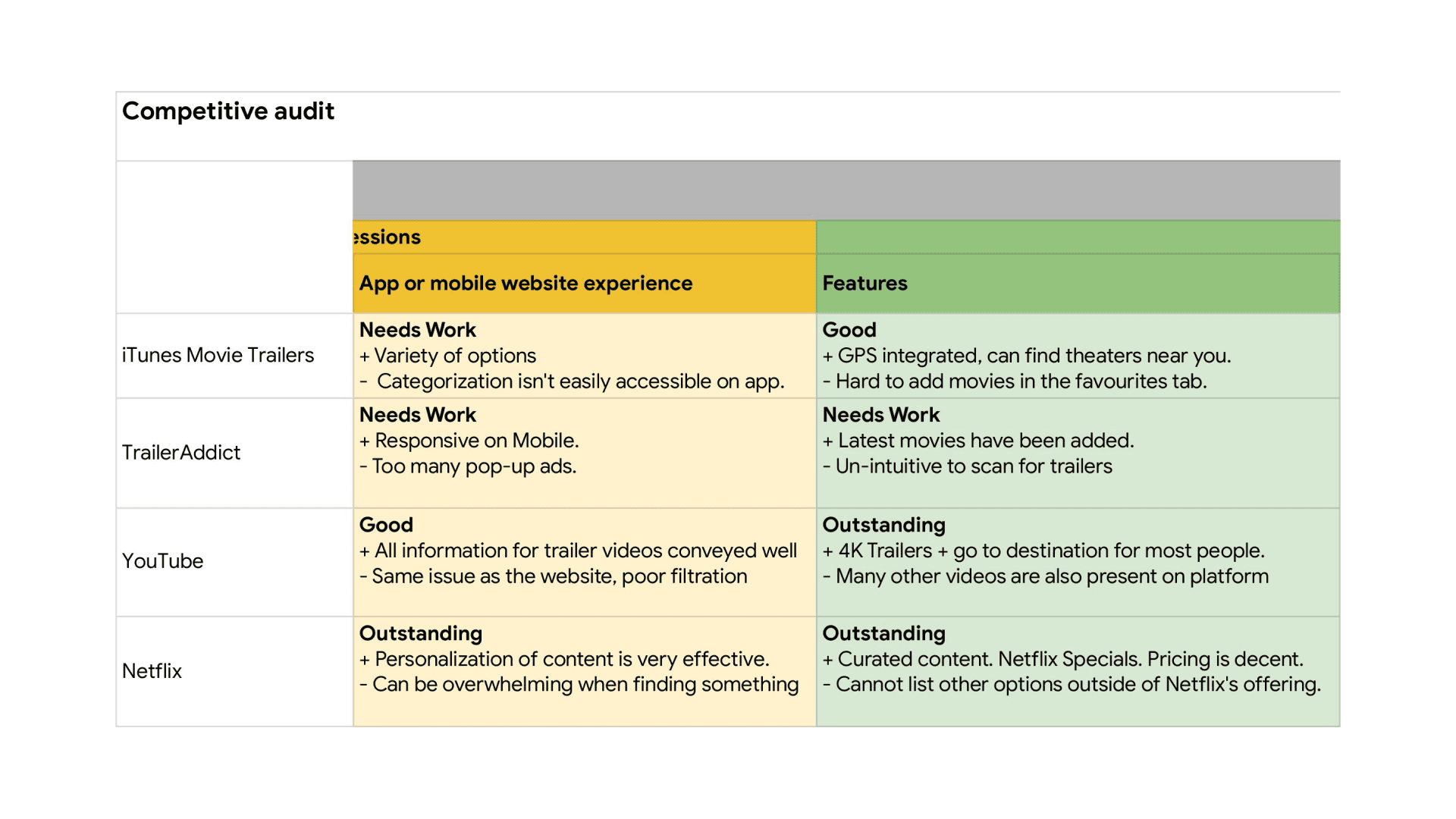
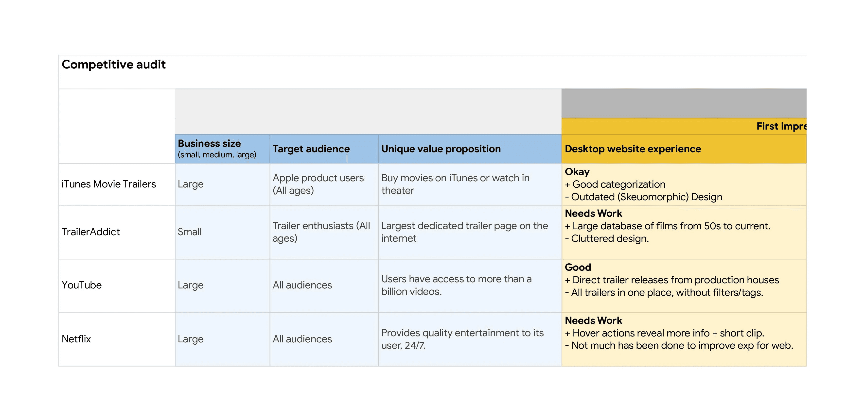
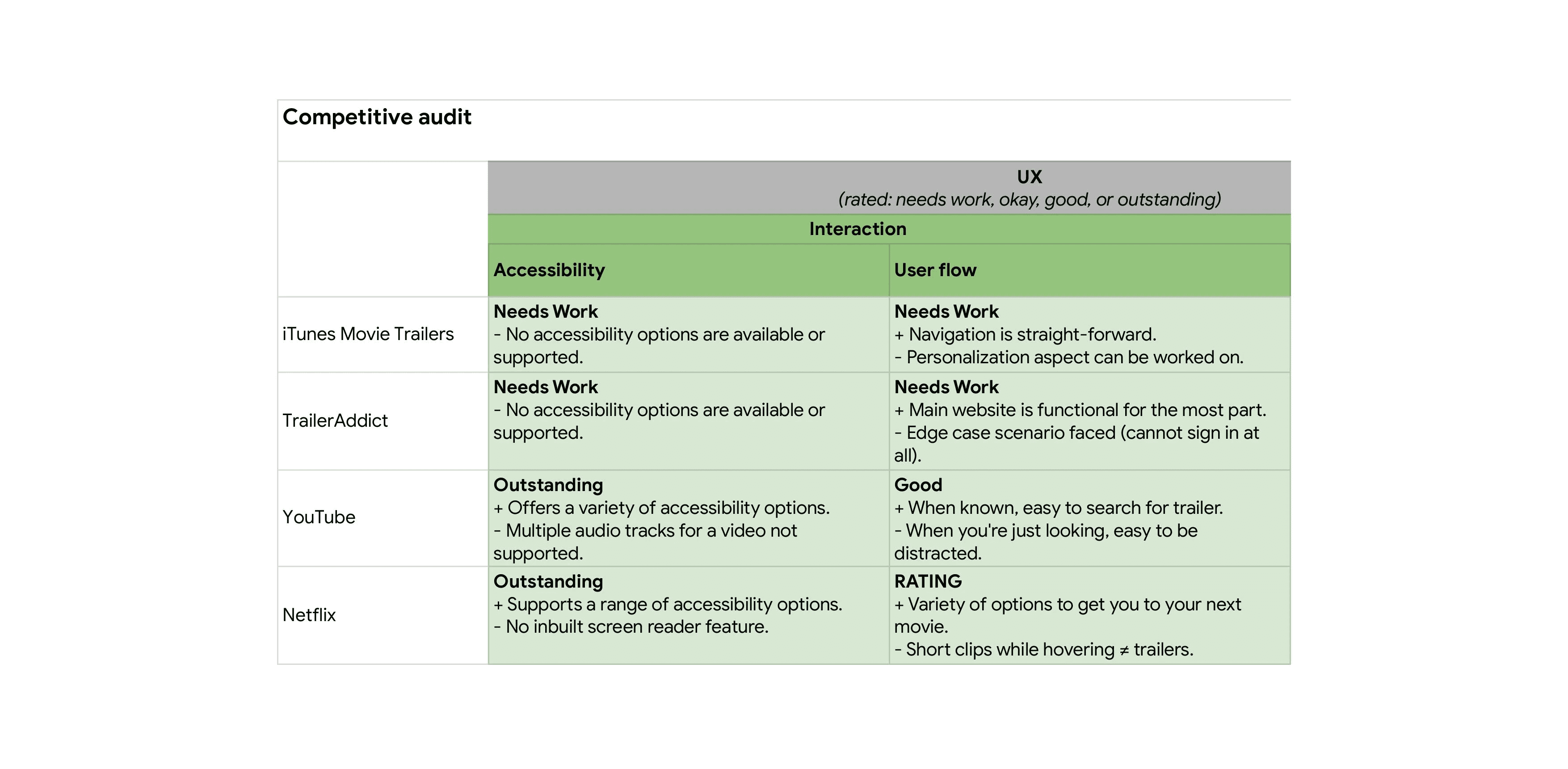
The main research for this project was done through user interviews and competitive audits. Doing these were crucial to understanding what the pain points the users had with existing applications and how they could be improved.
User research study
I spoke with various participants from different backgrounds to understand their perspective on how they go about viewing trailers and booking their tickets.
Some of the research questions I looked into were as follows:
Does a personalized feed help in finding a desired movie?
Is booking through the same app a feature the users want?
What are the other features that could be missing from this app?
Would looking at user reviews for movies help people in making the right decision?
Does the app require a social media component to be successful or not?
User research notes
Findings
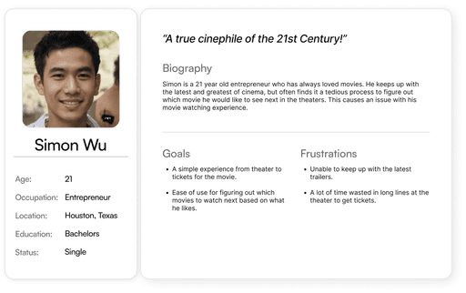
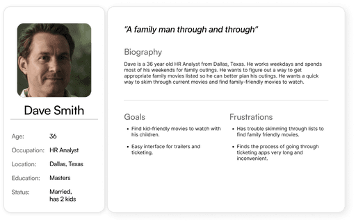
User personas
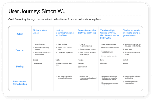
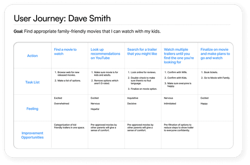
User journey maps
Analysis
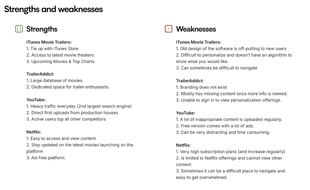
After completing the user research phase, I worked on the competitive audit, a SWOT analysis and identified gaps and opportunities.
Process
Ideation & user testing
Created different prototypes and conducted moderated user interviews to gather insights
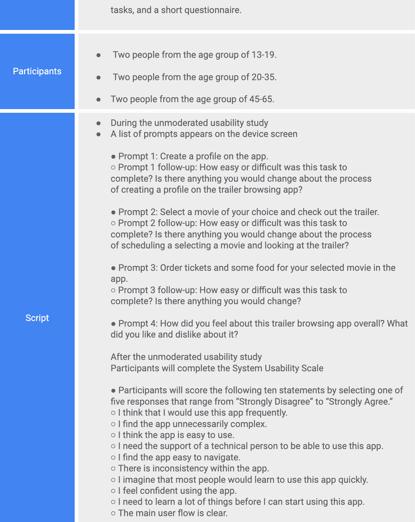
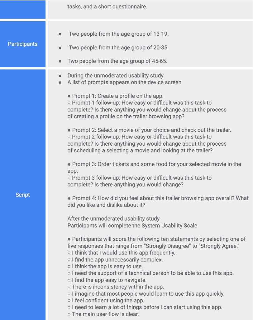
Methodology:
Type:
Moderated remote usability study
Participants:
Five participants, between the ages of 24-54
Script:
Tasks followed by survey questions, measured by Likert scale (Strongly disagree - Strongly agree)
KPI's for evaluation:
drop-off rates;
conversion rates;
& system usability scale.
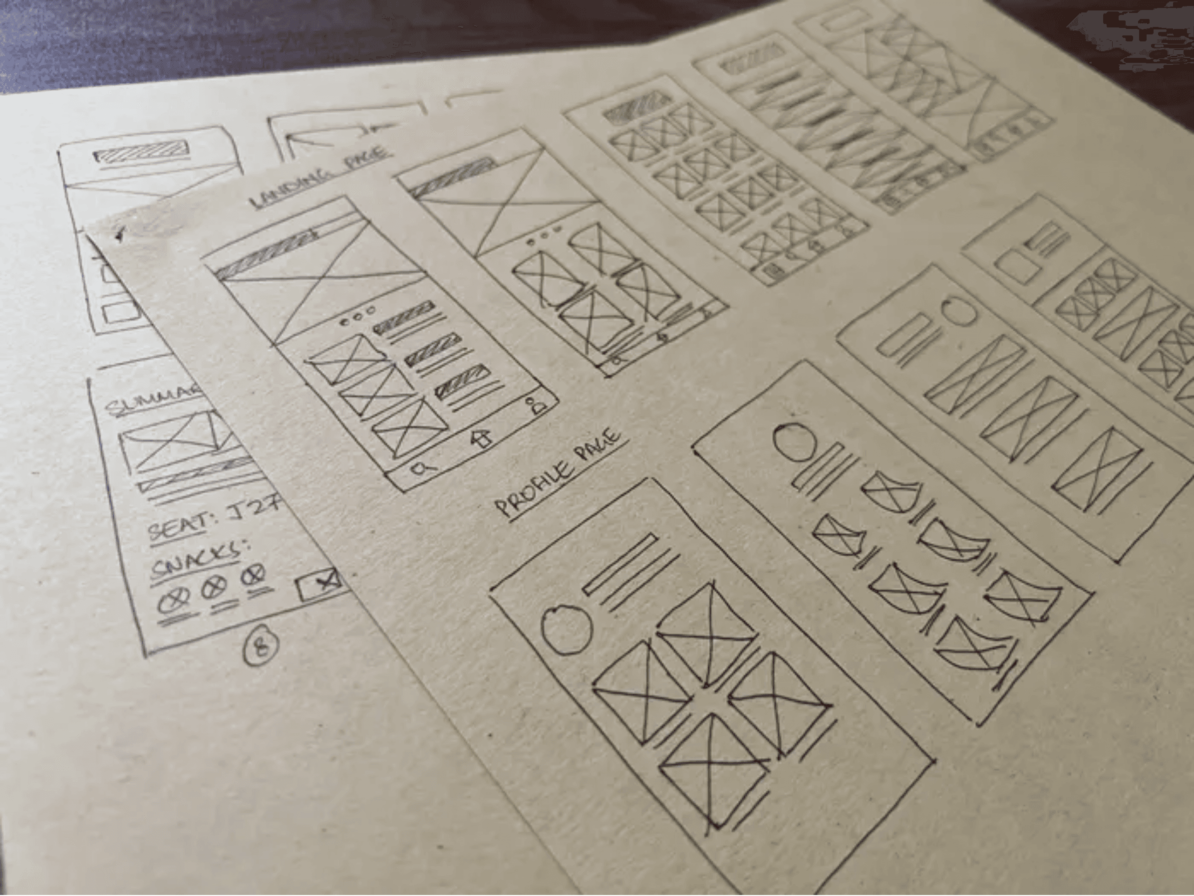
Initial sketching explorations
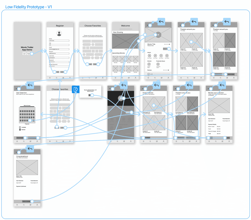
Low fidelity prototype -I
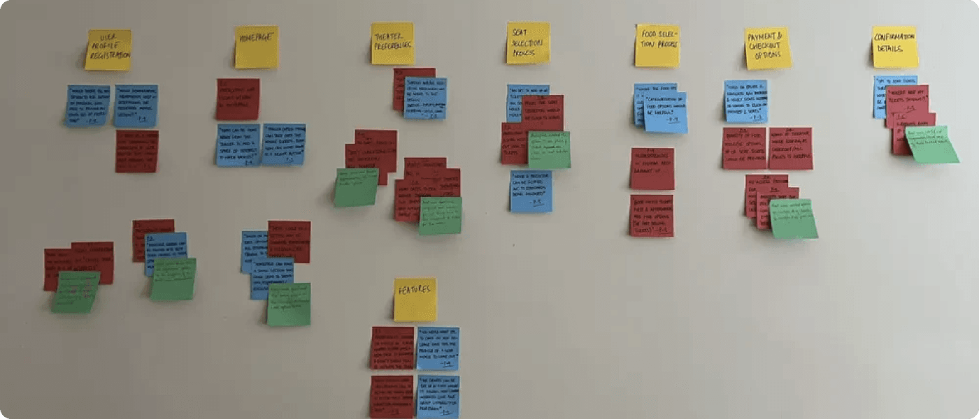
Affinity mapping
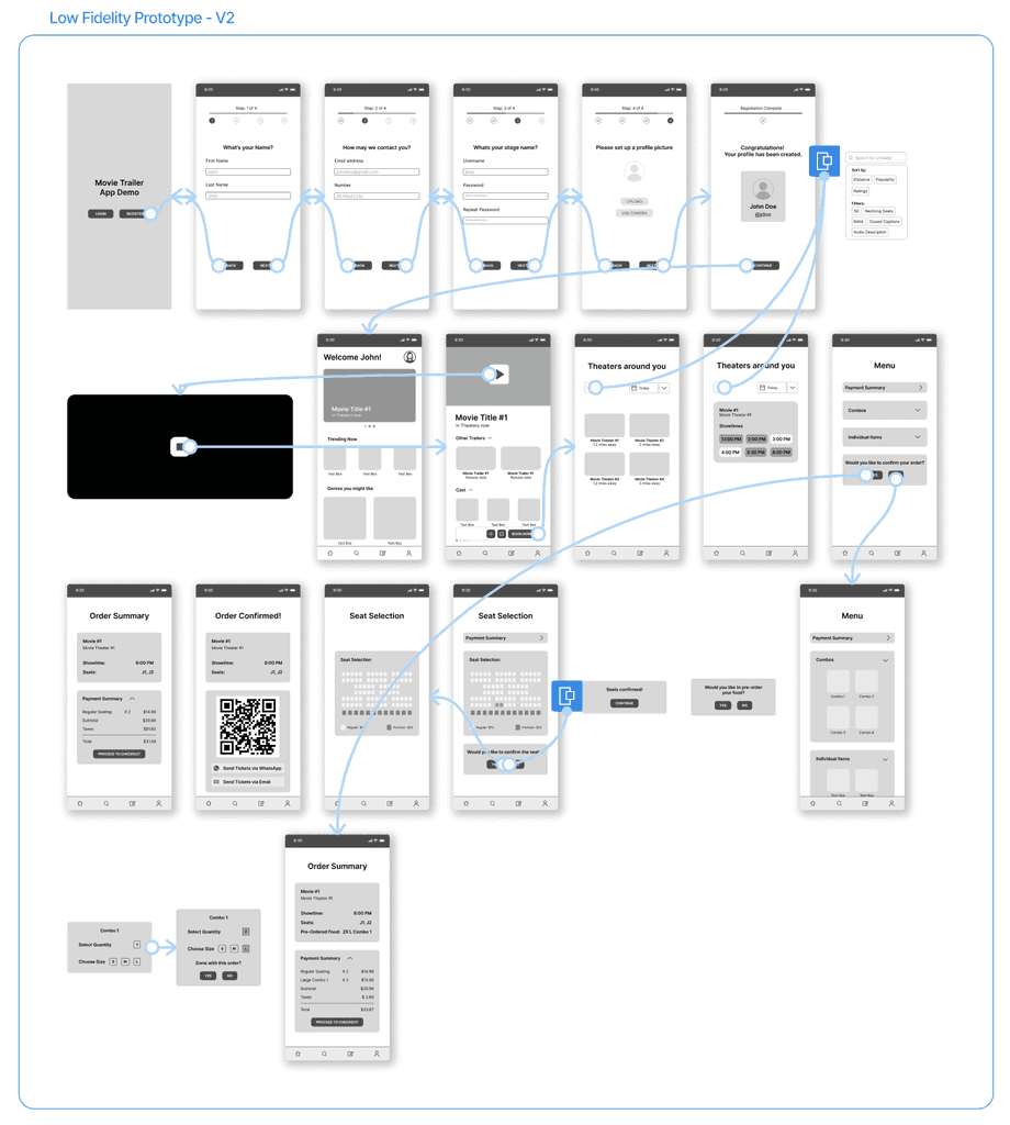
Low fidelity prototype -II
Low fidelity prototype -II
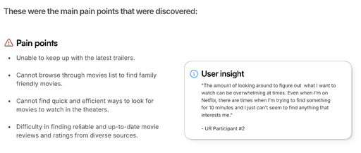
Some of the quantitative feedback gathered from the user testing was as follows:
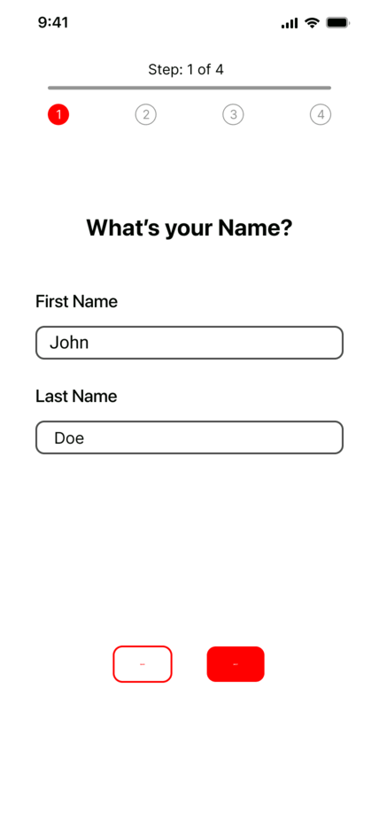
Registration was overwhelming
Users prefer smaller and easier steps for registration instead of all options being presented at once.
Enable external notifications
Users wanted an option to send an external notification and/or a more visual confirmation after tickets have been booked.
Lack of clarity regarding confirmation
Users had trouble understanding if their tickets were booked after going to the main homepage.
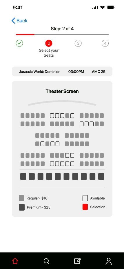
Booking detail visibility
85% of the user participants wanted the option to see the details of their booking at all times in the booking process.
Final design
After creating the actionable insights from the second usability study, I started working on the high-fidelity mockups and prototyping what the flow of the app would be like.